New Live Preview navbar.
Visitors coming from mobile devices are more and more common and is even becoming the main source of visitors for many websites already. With this in mind, we re-design the navbar in the Live Preview page of each template in BTemplates. The new navbar has the options to show you the template in 5 different viewports or screen resolutions:
- Desktop.
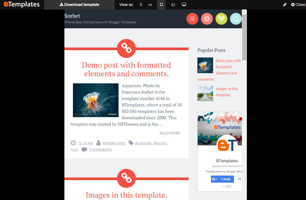
- Table Portrait. 768×1024 px.
- Tablet Landscape. 1024×768 px.
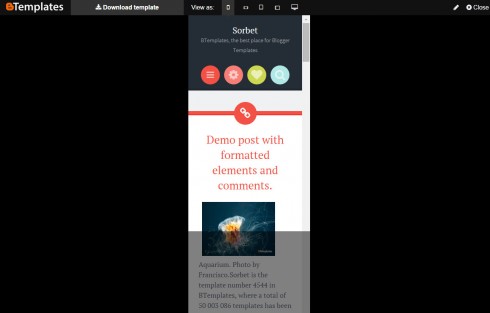
- Smartphone Portrait. 320×568 px.
- Smartphone Landscape. 568×320 px.

Sorbet template on a Phone viewport.
In this way, you have an idea about how your blog is going to look under this circumstances. But, of course, the real look in a mobile device is going to vary depending on the browser and how well is the template adapted for small resolutions.
And if the template is not responsive, we are going to let you know with a small notification in the navbar:

No responsive template warning.
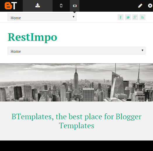
Finally, the new Navbar itself is also responsive making possible to see a preview of lower screen resolutions in your mobile devices:
This is just a little change but we want to share it with you and hopefully it helps you find you perfect Blogger template.
Ah! A mobile friendly re-design for BTemplates is its way. Feel free to leave your thoughts about how make our website easier to use in the comments.

