
LMS Education Tlalli is the next generation of our education-focused Blogger template. Built on Bootstrap 5.3 with a Mediterranean palette, it brings a full-bleed animated hero, interactive cards, and a powerful shortcode system to make publishing courses, lessons, and resources effortless. Tlalli has two versions: the Pro version adds dark mode, auto-generated labels gallery, random tag shortcode, and credit removal, while the Free version is fully functional with all core features.
Template Options Widget
The Template Options gadget (LinkList46) sits in your Layout’s settings section. It lets you control core layout and styling without touching code.

| Setting | Values | Default | Description |
|---|---|---|---|
| Sidebar Location | left, right, none | right | Moves the sidebar or hides it entirely |
| Top Menu Is Always Visible | true, false | true | Keeps the navbar sticky on scroll |
| Header Height | Number (pixels) | 560 | Hero section height on desktop |
| Header First Word Accent Color | true, false | true | Colors the first word of titles with the golden accent |
| Force Uppercase In Titles | true, false | false | Transforms all heading and post titles to uppercase |
| RTL Direction | true, false | false | Switches layout to right-to-left for Arabic, Hebrew, etc. |
The main navigation menu is based on a LinkList gadget (located in the MainMenu section, locked). How you name each link determines how it behaves. Below are all the supported patterns with step-by-step instructions.
To add a simple link with no dropdown, just set the Site Name and Site URL fields normally.
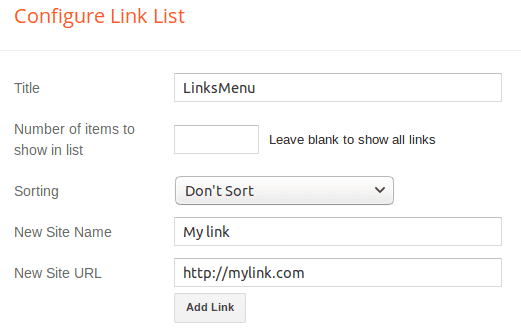
Example: set Site Name to Home and Site URL to your blog’s homepage URL. The result is a single clickable item in the navbar.
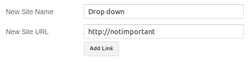
Menu item with dropdown (one level of sub-items)
You need two or more LinkList entries to create a dropdown group:
Step 1: Create a regular link that will serve as the dropdown parent. The URL is not relevant — it won’t be clickable.
Step 2: Create a second link for the first child item. This time, add a dash (-) at the beginning of the Site Name field and the real URL:
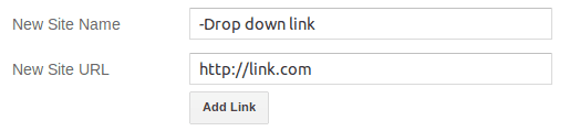
Step 3: Add as many child items as you need. Every child must start with a dash in the Site Name field.
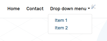
Full gadget example — this setup produces a “Drop down menu” parent with three children:
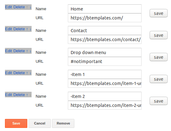
To create a second nested level, use a double dash (--) at the beginning of the Site Name. Only items directly after a single-dash child become part of its submenu.
Example gadget setup:

Drop down menu(no dash — parent, not clickable)-Menu item(one dash — first dropdown child)--Submenu item(two dashes — nested under “Menu item”)-Another item(one dash — second dropdown child, at root level)
Menu item with AJAX post list
To display a live list of posts from a specific label inside a dropdown, add a new link following this format:
tag:LabelName-NumberOfPosts-ShowThumbnailWhere:
LabelName— the Blogger label (case-insensitive)NumberOfPosts— how many posts to fetch and displayShowThumbnail—trueorfalse(show thumbnail images or text only)
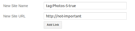
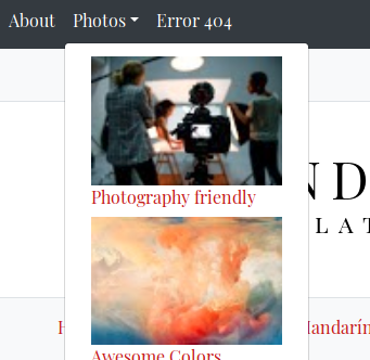
Example: to show 5 posts from the label “Courses” with thumbnails, create a link with:
- Site Name:
tag:Courses-5-true - Site URL: any value (it won’t be used)
The result is a dropdown that fetches post titles and thumbnails via AJAX:
Create a link with Site Name set to search and any URL. The template automatically replaces it with a search toggle. On desktop a dropdown search form appears on click; on mobile an inline form is shown directly. Both auto-focus and prevent empty submissions.
Adding the dark mode switcher Pro only
Create a link with Site Name set to theme and any URL. The template replaces it with a theme switcher dropdown offering Light (sun icon), Dark (moon-stars icon), and Auto (half-circle icon, follows system preference).
The gadget shown above produces a navbar with: Home (regular), Drop down menu (parent with children), Courses (AJAX post list dropdown), a search form, and the dark mode toggle.
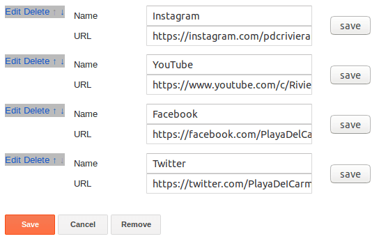
The navSocial section uses a LinkList gadget (LinkList68). Add your social media URLs and the template auto-detects each network, rendering the matching Bootstrap Icon. Over 40 networks are supported including Facebook, Instagram, X, YouTube, TikTok, Mastodon, and more.
Full gadget example:
Hero Section
The full-bleed hero is powered by four gadgets in your Layout:
| Gadget | Section | Purpose |
|---|---|---|
| Image | heroBg | Background image (1600px wide recommended) |
| Header | heroContent | Title & subtitle text |
| HTML | heroCta | Call-to-action button using the cta: shortcode |
| HTML | heroFeatures | Feature icons using the feat: shortcode |
To edit the hero background:
- Go to Layout → look for the Hero Background section
- Click Edit on the Image gadget
- Upload a new image (at least 1600px wide for best results)
- Save the gadget
To edit the hero title and subtitle:
- Go to Layout → Hero Content section
- Click Edit on the Header gadget
- Change the title and description fields
- Save
To edit the hero CTA button:
- Go to Layout → Hero CTA section
- Click Edit on the HTML gadget
- Enter a
cta:shortcode (see Shortcodes Reference below) - Save
To edit the hero features row:
- Go to Layout → Hero Features section
- Click Edit on the HTML gadget
- Enter a
feat:shortcode (see Shortcodes Reference below) - Save
The hero includes a homogeneous dark overlay, animated geometric shapes (circles and dots), entrance animations on all elements, and a scroll-down indicator linking to the Featured Courses section. Header height is configurable via Template Options.

Homepage Sections
All homepage sections appear only on the homepage. Each is powered by an HTML widget that contains a single shortcode line.
| Section | Widget | Default Shortcode | Display Style |
|---|---|---|---|
| Featured Courses | HTML49 | 6-tag:Courses-600px-course | Course cards with badge, author, excerpt |
| Testimonials | HTML59 | 3-tag:Testimonials-400px-testimonial-grid | 3-column quote cards with avatar |
| Labels Gallery | Label3 Pro / HTML95 Free | Explore Topics-BTLabels (Pro) / Static HTML (Free) | Auto-generated image cards (Pro) / hardcoded cards (Free) |
| Stats / Trust | HTML85 | stat:1500,bi-people-fill,Active Students|... | Animated counters, 4-column grid |
| Latest Blog | HTML79 | 3-tag:Blog-600px-bloglist | Blog post cards with “Blog” badge |
| Featured Video | HTML96 | 1-tag:Videos-800px-video | YouTube embed + summary |
| Contact | ContactForm1 | Native Blogger form | Name / Email / Message |
| Campus Gallery | HTML98 | 4-tag:Campus-600px-mosaic | 4-column image mosaic with tags |
To edit which posts appear in a section:
- Go to Layout and find the section on the homepage
- Click the Edit icon


- Change the shortcode to point to your label. For example, to show 6 posts from a label called “Courses” in course card style:
6-tag:Courses-600px-course - To show the latest posts regardless of label, use
latest:6-latest-600px-course - Save the gadget
Labels Gallery
Pro Version
The Pro version auto-generates a visual labels gallery directly from your Blogger labels. To set it up:
- Go to Layout → Labels Gallery section
- Click Edit on the Labels widget
- Set the title to
Explore Topics-BTLabels - Click Selected Labels, pick the labels you want to display, then click Done
- Save the gadget
A background image widget (Image91) adds the section background — upload an image at least 1600px wide.
Free Version
The Free version uses a static HTML gadget with 4 pre-designed category cards (Blog, Campus, Courses, Videos). To customize:
- Go to Layout → Labels Gallery section
- Click Edit on the HTML widget
- Update the link
hrefattributes and thumbnail imagesrcfor each card - Save the gadget
Shortcodes Reference
Shortcodes are single lines of text you place inside HTML widgets or blog posts. The template reads them and replaces them with dynamic content.
Post List Shortcode (in HTML widgets)
{N}-{postsType}-{size}px-{style}Parameters:
N— number of posts to showpostsType—latest(most recent),tag:LabelName(posts under a specific label), orrandomtag(random label)size— thumbnail width in pixelsstyle— display style (see table below)
Available styles:
| Style | Description |
|---|---|
list (default) | Thumbnail + title + summary + date |
simplelist | Minimal list with chevron links |
course | Card with “Course” badge, author, date, excerpt, overlay |
bloglist | Card with “Blog” badge, date, excerpt |
testimonial-grid | 3-column quote cards with avatar, name, role |
mosaic | 4-column image grid with overlay title + tags |
video | Title + embedded YouTube video |
menulist | Compact items with optional thumbnail |
Real-world examples:
6-latest-600px-course             Latest 6 posts as course cards
3-tag:Testimonials-400px-testimonial-grid  3 testimonials in grid
1-tag:Videos-800px-video          Latest video from "Videos" label
4-tag:Campus-600px-mosaic         Campus gallery in 4-column mosaic
3-latest-65px                     Latest 3 posts, sidebar list
3-tag:Courses-65px                Latest 3 courses, footer list
6-tag:Blog-350px-bloglist         Latest 6 blog posts as cards
Shortcodes Inside Posts
Place this anywhere in your post content to embed a dynamic post list:
[posts--tag:LabelName--N--style]The style parameter is optional and defaults to simplelist. Available styles: list, simplelist, course, bloglist, testimonial-grid.
Examples:
[posts--tag:JavaScript--5]              5 posts, simple list (default)
[posts--tag:Courses--3--course]         3 posts as course cards
[posts--tag:News--6--bloglist]          6 posts as blog cards
[posts--tag:Testimonials--3--testimonial-grid]  3 testimonials in grid
This is useful to create course content pages, resource directories, or lesson lists inside any post.
Random Tag
Use randomtag as postsType to fetch posts from a random label. The template first fetches all labels from your blog, picks one at random, then fetches posts from that label. Great for discovery sections or “surprise me” features:
6-randomtag-600px-courseComments Shortcode
N-commentsExample: 3-comments — displays 3 recent comments with avatars and snippets. Best used in sidebars or footer columns.
CTA Shortcode
cta:url|text|icon-classExample: cta:#bt-courses|Browse Courses|bi-arrow-right — renders a button linking to the Courses section. The icon class can be any Bootstrap Icon from the full icon reference (e.g., bi-arrow-right, bi-play-circle, bi-book).
To link to an external page: cta:https://example.com|Visit Site|bi-box-arrow-up-right
Features Shortcode
feat:text,icon|text,icon|...Each text,icon pair is one feature item. The pipe (|) separates items. Icon names follow the bi- prefix from the Bootstrap Icons library.
Example: feat:Expert Teachers,bi-mortarboard-fill|Online Courses,bi-laptop|Certificates,bi-patch-check-fill
This renders a horizontal row of icon + text items in the hero section, each with a staggered fade-in animation.
Stats Shortcode
stat:count,icon,label|count,icon,label|...Each count,icon,label group is one stat item. Pipe separates items. Icon names follow the bi- prefix from the Bootstrap Icons library.
Example: stat:1500,bi-people-fill,Active Students|45,bi-journal-bookmark-fill,Courses Available|12,bi-award-fill,Expert Teachers|98,bi-globe-americas,% Satisfaction
Numbers count up from 0 to the target value automatically when the section scrolls into view. The animation runs over 50 steps at 30ms intervals for a smooth effect.
Widget Title Markers
You can modify how widget titles behave by appending special markers to the title field in any gadget.
Adding a description (-desc:)
Blogger gadgets don’t natively support descriptions. To add one, append -desc: followed by your description text to the title:
Title-desc:Description textExample: a Label widget titled Topics-desc:Explore our course categories shows:
- Title: Topics
- Description: Explore our course categories (in a lighter, smaller font below the title)
This works on any gadget type — Labels, PopularPosts, HTML, LinkList, etc.
Activating the labels gallery (-BTLabels)
Append -BTLabels to a Label widget’s title to transform it into a visual card-style label gallery:
Explore Topics-BTLabelsIn the Pro version, this auto-generates image cards from your labels. In the Free version, the labels list needs static HTML. The -BTLabels suffix is stripped from the displayed title automatically.
Dark Mode Pro only
The Pro version includes a full dark mode implementation using Bootstrap 5.3’s data-bs-theme attribute. All colors, shadows, and surfaces adapt automatically.
How to enable it
- Go to Layout → Main Menu section
- Click Edit on the LinkList gadget
- Add a new link with Site Name set to
themeand any URL - Save the gadget
The template replaces the item with a theme switcher dropdown offering three options:
- Light —
bi-sun-fillicon - Dark —
bi-moon-stars-fillicon - Auto —
bi-circle-halficon (follows system preference and updates in real time)
Dark Mode Logo
To use a different logo in dark mode:
- Go to Layout → settings section
- Add an Image gadget titled
Dark Mode Logo (Optional) - Upload an alternative logo designed for dark backgrounds (lighter colors, no dark elements)
- Save
The template swaps logos automatically when dark mode is active and reverts when switching back to light mode.
Persistence
The theme preference is stored in localStorage and persists across sessions. The Auto mode listens for OS-level prefers-color-scheme changes via matchMedia and updates the page in real time without a refresh.
Sidebar Widgets
| Widget | Gadget | Notes |
|---|---|---|
| Search | BlogSearch43 | Bootstrap-styled search form |
| Latest Posts | HTML67 | Default: 3-latest-65px (latest 3 posts, list style) |
| Follow Me | LinkList73 | Auto-detected social icons |
| Categories | Label1 | Label cloud with post counts |
| About | Profile1 | Author/team profile with avatar |
The footer has a 3-column layout (col-md-6 col-lg-4):
| Column | Widget | Description |
|---|---|---|
| Footer 1 | PopularPosts2 | Popular posts with thumbnails and snippets |
| Footer 1 | BlogArchive2 | Monthly blog archive (flat list) |
| Footer 2 | HTML1 | Latest courses via shortcode (default: 3-tag:Courses-65px) |
| Footer 2 | Label2 | Category cloud |
| Footer 3 | HTML63 | Recent comments (default: 3-comments) |
| Footer 3 | Text19 | About text |
| Footer 3 | Image19 | Footer logo / image |
The footer bottom bar includes an auto-updating copyright year and a menu for additional links.
Post Features
Breadcrumbs
On single post pages, breadcrumbs show Home · Label · Post Title with a clean transparent design and hover underline effect.
Post Header Card
Every post shows a header card with:
- Post title (with optional first-word accent color when enabled in Template Options)
- Author name with accent icon
- Publish date (configurable via Blogger’s
showTimestampsetting) - Reading time estimate (auto-calculated at 200 words per minute)
- Comment count
- Label pills (terracotta background with gold hover)
Post Pager
Previous and next post navigation with card-style thumbnails appears at the bottom of each post.
Loading Skeletons
CSS-only shimmer placeholders are shown while AJAX post lists load, keeping the experience smooth on slow connections. These skeleton cards match the shape of the actual content being loaded.
Customization
CSS Custom Properties
The template uses CSS custom properties for easy theme overrides. Key variables:
--color-primary: #C65D3E;
--color-secondary: #1A4A5A;
--color-accent: #D4A434;
--color-dark: #3C3028;
--color-light: #F9F3EA;
--font-display: 'DM Serif Display', Georgia, serif;
--font-body: 'Inter', system-ui, -apple-system, sans-serif;
--radius-sm: 6px;
--radius-md: 12px;
--radius-lg: 20px;
Blogger Theme Designer
Key customizable variables via Layout → Theme Designer:
- Main color (primary brand, default
#C65D3E) - Body text font and color
- Link colors (default, visited, hover)
- Blog title font and color
- Post title font and color
- Post text font and color
- Footer background color
- Hero subtitle color
Dark Mode Colors Pro only
When [data-bs-theme="dark"] is active, these variables invert automatically for a comfortable dark reading experience:
--color-primary: #D07050;
--color-secondary: #3A8A9A;
--color-accent: #E6BE5A;
--color-dark: #E8E0D5;
--color-light: #1E1A17;
--color-surface: #2A2522;
FAQs
How do I change the hero background?
Go to Layout → Hero Background section → click Edit on the Image gadget and upload a new image (1600px wide recommended).
How do I edit the hero title?
Go to Layout → Hero Content section → edit the Header gadget. The title and subtitle fields control what shows in the hero.
How do I change which posts appear in Featured Courses?
Edit the HTML gadget in the Featured Courses section and change the label in the shortcode. Example: 6-tag:MyLabel-600px-course.
How do I enable dark mode?
Pro only Add a LinkList item with the text theme to the main menu. The template automatically replaces it with the dark mode toggle.
How do I add a dark mode logo?
Pro only Add an Image gadget in the settings section titled Dark Mode Logo (Optional) and upload your alternative logo.
In the Template Options gadget, set Sidebar Location to none.
How do I add a list of posts inside a post?
Use the post-body shortcode: [posts--tag:LabelName--5] anywhere in your post content. Works for course modules, lesson directories, resource lists, etc.
Edit the LinkList gadget in the navSocial section. Add your profile URLs as links — the template detects each network automatically.
How do I update the logo?
Go to Layout → Page Header section → click Edit and upload your logo image.
How do I customize the labels gallery in Free?
Edit the HTML widget in the Labels Gallery section to update card links and images. For automatic generation, upgrade to Pro.
Changelog
- 17-05-2026 — Initial release of LMS Education Tlalli. Bootstrap 5.3, full-bleed animated hero, 9 homepage sections, shortcode system (10 display styles), Template Options widget (6 settings), widget title markers, RTL support. Pro: dark mode with logo swap, auto-generated labels gallery, random tag shortcode, credit removal.