Typography Blogger Blogger Template
Instructions
About Typography Blogger
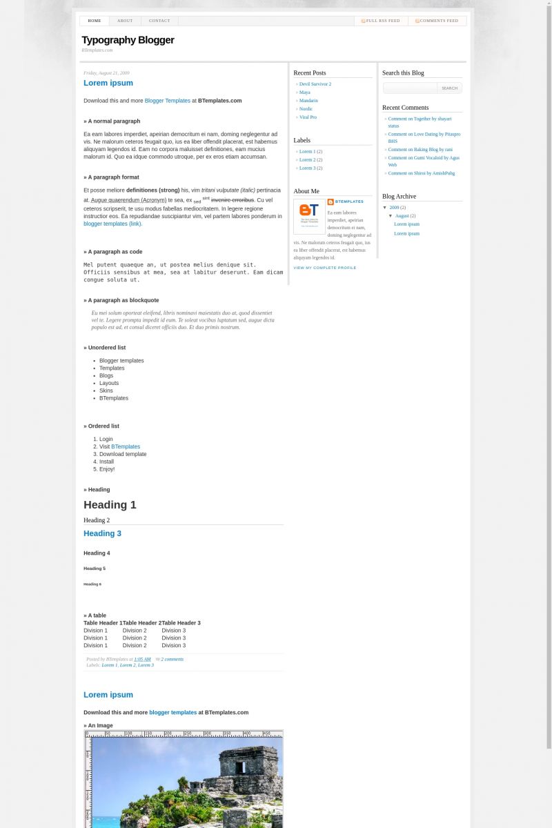
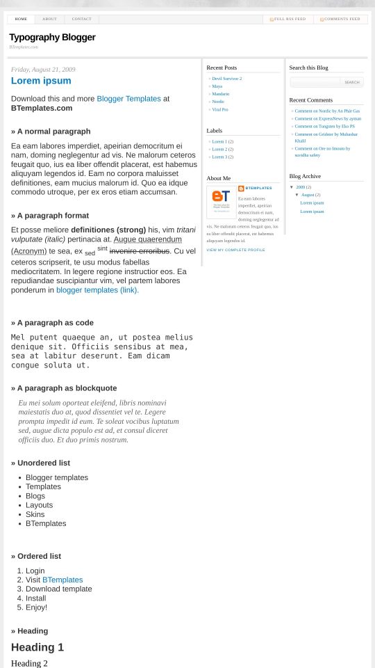
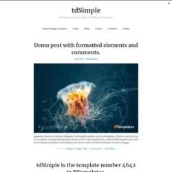
Introducing Typography Blogger, a free Blogger template originally designed for WordPress featuring 3 columns, right sidebar, minimalist design and neutral palette
More Minimalist Blogger templates:
Credits
Author: Deluxe Templates.

9uy 24 August 2009 at 15:06
Looks great, remind me of wordpress Thesis.
John 26 August 2009 at 11:41
This is a great template. Is there a way to move the search box so I can put “widgets” above it?
Neil 26 August 2009 at 13:15
Love the template – how do I set up the “Contact” link and remove the “about” link?
Cash Searcher 13 September 2009 at 17:00
Nice simple template that will work well with many subjects.
mica 1 January 2010 at 8:33
This template is beautiful and so easy to customise. It looks just like the Thesis theme on wordpress which is expensive to buy.
Thank you for this template.
mica 1 January 2010 at 9:46
You cannot change any colours on this template so everyone who uses it has the same standard theme and look. A bit disappointing since it looks like the thesis theme and i’d love to use it.
Velvet Report 18 February 2010 at 19:45
No, that’s incorrect…you can totally customize this template…I changed it to a 2 column instead of 3 and changed the blue letters to hot pink. I had also changed all the background and border colors before deciding on leaving it gray and white…also added extra links across the top bar.
You can basically do whatever you want with it if you have an understanding of html and the time to rework it. I figured out how to change all that stuff only through trial and error not because I actually knew what I was doing.
Feb. 18th 2010 today but might change to a different template altogether at a later date..
davidzu 8 April 2010 at 2:13
and remove the form template that brings
martha 20 May 2010 at 22:35
@Velvet Report: Hi there… you seem to know a lot about this, do you know how can i move a sidebar to the left and leave the main column in the middle?
thanks!