Whitemagic Blogger Template
Instructions
About Whitemagic
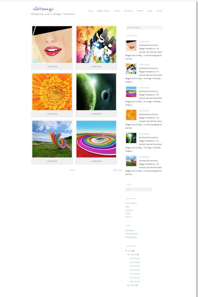
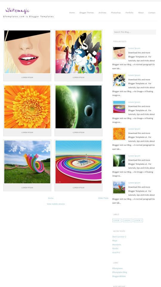
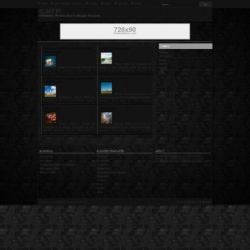
Introducing Whitemagic, a free Blogger template featuring 3 columns, right sidebar, gallery-style layout, rounded corners, exclusive Blogger theme, multi-column footer and post thumbnails
Perfect for blogs covering photography.
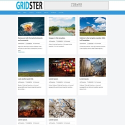
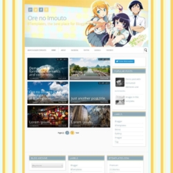
More Gallery Blogger templates:
Credits
Author: BloggerzBible.





ProLinking 2 March 2011 at 11:00
That’s quite a good template, but it has some errors I think.
Rae 4 March 2011 at 1:08
I keep clicking on download and it keeps sending me back to the main menu. What’s going on?
Claudia 5 March 2011 at 20:17
@Rae: The download button works fine for me (I’ve already checked it). Nevertheless, if if doesn’t work for you, please try in a different browser.
Rae 6 March 2011 at 0:30
The template was great until I realized that some of the text from my previous posts were stacked on top of one another making the post unreadable. What a shame. This template was my favorite. – Maybe that’s what’s meant by “has some errors I think”?
pranay raj 8 March 2011 at 23:47
how can i remove older posts & new posts link in this template.. ??
i cant find the phrase: ” #blog-pager-newer-link {
float: left;
}
#blog-pager-older-link {
float: right;
}
#blog-pager {
text-align: center;
} ”
to replace with
” #blog-pager-newer-link {
float: left;
display: none;
}
#blog-pager-older-link {
float: right;
display: none;
}
#blog-pager {
text-align: center;
display: none;
} ”
plz…help me… its urgent
Alysia 31 March 2011 at 16:35
I really like this template and I’m using it to set up a blog but I’m having a few image problems.
When I put images in the post they appear as they are supposed to on the post page (which is great, very easy to post and looks great there) however when the post is referenced on the main page the image is squashed into the cube.
How can I get the image to stay in it’s correct form (whether its square or landscape or portrait rectangle) on the post page a take a square highlight from the image for the home page without distorting proportions. I guess this is a bit like twitter- the picture icon is square and not distorted, even if the image uploaded is not.
If this isn’t possible, does anyone know a blog template, like this one, that can do this?
Nikki 28 March 2013 at 19:07
@Alysa did you ever find a way to correct this issue? I’m having the same problem as well
yani 5 April 2011 at 10:55
i love it and im using it but the menu doesnt show up:( but still im going to use this!
Mark 11 June 2011 at 15:43
@Alysia:
Hi – I’m having the same problem, Did you find an answer to this?
Thanks
Mark
Ordinary Photo 23 June 2011 at 18:25
I will use for my blog now Like this template
cofee 20 July 2011 at 21:04
Hello I really like this template, only one question as I can resize the image of each publication, which is square rather than rectangular is as if it were a DVD.
Cafeine 7 August 2011 at 4:26
The Menu isn’t appearing for me.
The HTML/JavaScript widget in Blogger painel called Menu is blank
Scott 11 March 2012 at 4:43
I love this template – it does almost everything I want it to do.
The facebook/twitter buttons are invisible at the bottom of each image – some tweek needed there I think.
Other than not having worked out how to increase the menu text – i’m finding it really great!
Thanks!!
Nikki 28 March 2013 at 19:05
Hi, I’m having the same problem as some of the above users. I really like this template, but the pictures on the post are squashed. How do I get the full image to show on the home page?
Mr. R 27 October 2013 at 8:06
nice template, thanks