Proximus Blogger Template
Instructions
About Proximus
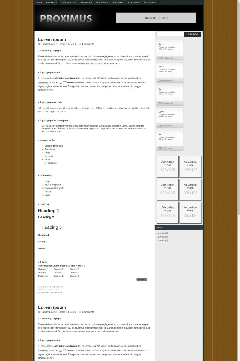
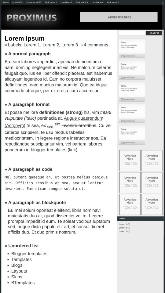
Introducing Proximus, a free Blogger template featuring 2 columns, magazine-style layout, right sidebar, clean, fresh appearance, ad-ready spaces and neutral palette
More Magazine Blogger templates:
Credits
Author: BloggerThemes.


Gerardo 14 June 2009 at 19:34
It looks great, but i dont like the background
Floyd 14 June 2009 at 22:12
I really like this one I tried it out, there was a white and Grey bar appeared under the link bar and I could not manage to rid myself of it, it went across the header. I will try it out again in a few days and see if it is still there.
Claudia 15 June 2009 at 0:35
Floyd: Open the psd file, create a logo, and upload the image. That will solve your problem.
Suzuzaa 30 June 2009 at 22:22
“It looks great, but i dont like the background” me too.
“Open the psd file, create a logo, and upload the image. That will solve your problem.” thanks
Gerardo 1 July 2009 at 22:10
Excelente Theme, muchas gracias por compartirlo sera e mucha ayuda :D
skywind 4 July 2009 at 9:50
Page layout probably a little question.
Health information & Humor & Fun World
netto 17 August 2009 at 17:46
very good (Y)
Veronica 8 September 2009 at 0:04
Looks good, though I did several edits to it.
I don’t like the way the preview for a post with a photo shows up.
It completely distorts the image until you click ‘more’
and I have no idea how to fix this.
Ideas?
aziz 2 February 2010 at 14:06
thx a lot for this template
mwahaha 13 February 2010 at 0:23
how do i put ads beside the title?
mwahaha 13 February 2010 at 0:24
and how do i edit the links at the top?
mwahaha 13 February 2010 at 0:25
srry got the links at the top
mwahaha 13 February 2010 at 0:26
srry got the ad beside the tile too lol
nice template btw
mwahaha 13 February 2010 at 20:35
how do i make the digg, delicious stumble to work?