Penciling Blogger Template
Instructions
About Penciling
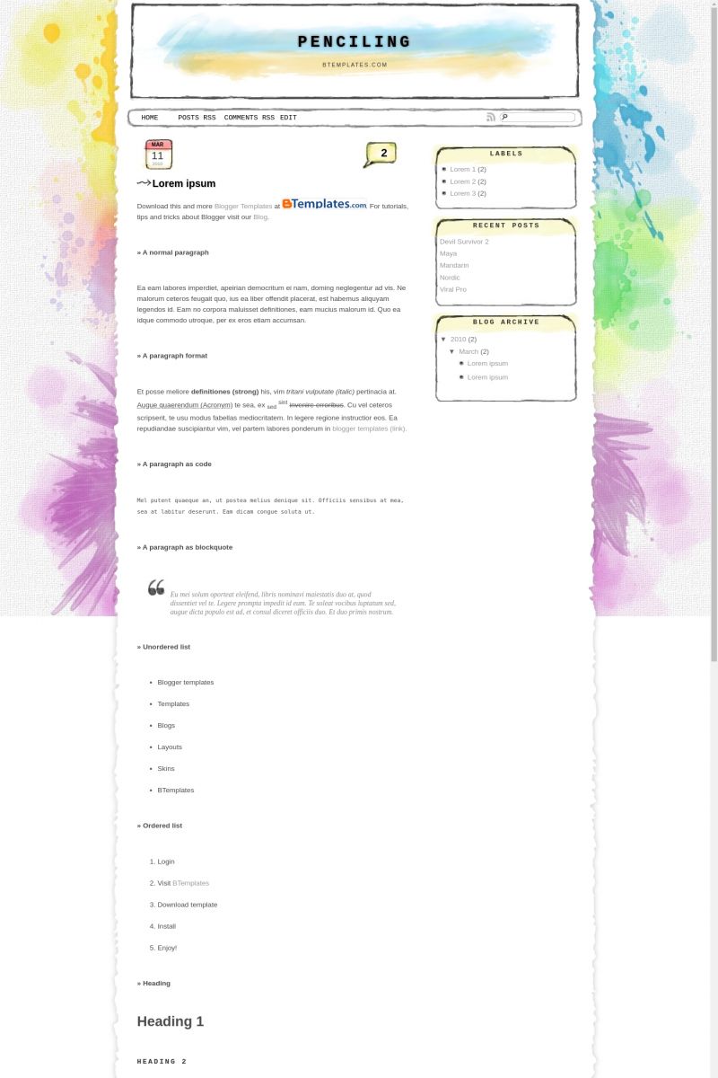
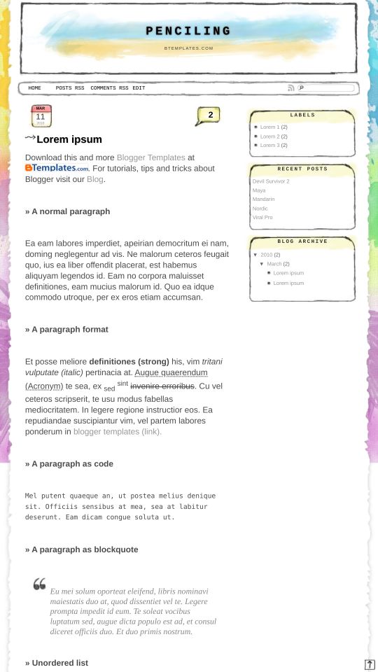
Introducing Penciling, a free Blogger template featuring 2 columns, right sidebar and rounded corners
Perfect for blogs covering art or kids.
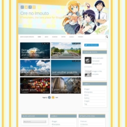
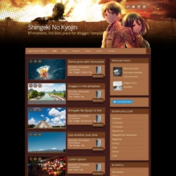
More Kids Blogger templates:
Credits
Author: Eternal Thinker.


RemiGray 25 June 2010 at 0:56
This is gorgeous.
Svenn 28 June 2010 at 6:39
It’s lovely! I just have 1 question: how to fix the undefined post date? I tried through the setting and changed the date formats, it didn’t work. Help.
Rahul 28 June 2010 at 10:12
This happens because the date format is not set to the correct type. You can fix this easily.
Please see the instructions at Penciling template’s documentation:
http://penciling-demo.blogspot.com/2010/05/quick-reference.html#essentials
Leo 1 July 2010 at 8:09
This is the bestest so far. I developed an instant love soon it was installed on my blog! I also have one question: how to create new post when I am on the homepage? Please help. Thanks
Rahul 1 July 2010 at 9:56
Thank You! :)
You can easily put a link to create new post on your homepage. The code is as follows:
Create Post
Inorder to get the blog ID(the 000000), go to dashboard and click on create post button. In this page, check the link in the address bar of browser and you will see the blogID=000000 part!
Rahul 1 July 2010 at 9:58
@ Leo
Sorry, in the above comment, the html part was converted to a link.
The code in place of ‘Crate Post’ link in above comment is:
<a href="http://www.blogger.com/post-create.g?blogID=000000">
Create Post</a>
Leo 1 July 2010 at 22:44
@Rahul:
Hi Rahul, thanks for the prompt reply. I have edited the HTML code following up your instruction. However, I encountered a formatting issue on the navigation bar, the words appear as “Home Create PostFacebook”. I could still separately and individually access Create Post and Facebook. Only the appearance on the navigation bar looks a bit ‘unfinished’ as you could tell there is a bit of space between the first word “Home” and the next “Create Post”. So please again, help me write a code to create such equal space as I tried a few things and did not work! Thanks again
Rahul 2 July 2010 at 10:54
@Leo: I’ve replied in detail to your mail. Hope you find it helpful! :)
Jhari 4 July 2010 at 17:50
Hi Rahul, I’m using your theme and I can’t seem to make the smileys work. Can you help me with it please?
Thanks in advance.
Rahul 5 July 2010 at 1:35
@Jhari: The smileys are already installed in the template and you just have to type in the right symbols to make it work. If the smileys are not displaying, its probably due to one of the following problems:
0) You should type in the symbol right, of course!
1) You should ALWAYS put a space between the smiley symbol for it to work.
2) If you are doing any formatting around the text containing the smiley symbol(bold, italics, text-color etc) the extra tags can sometimes prevent the smiley from being recognized. So try to put the smiley symbols outside such formatting in an independent way.
3) The smiley pics load only after the entire page is loaded. It can happen that some content in your page hasn’t completely loaded yet, say, if the connection is slow.
4) There may be some conflicting javascripts in your blog which prevents the smiley script from working normally. Please check on the extra scripts yu’ve used in the blog.
Thyas 7 July 2010 at 1:59
Hi, Rahul i just wanna say a love your theme
suhana 10 July 2010 at 2:18
hai rahul
i already use this template, and i really like. The problem is, there’s double post after the entries. How to remove that? thank you..
Rahul 10 July 2010 at 3:11
@suhana: The double post entry is seen on some blogs, but I think its independent of what template you use. The solution seems to be simple:
You can this link in the official blogger help.
Constance 20 July 2010 at 2:44
Hi! How can i delete the widget with the author rights that comes by default? I really love this template! Is all i been waiting!
PD: Sorry for my poor english…
Constance 20 July 2010 at 2:47
don’t worry i found it..
Rahul 20 July 2010 at 2:49
@ Constance
I assume you mean the author credits in the footer. The blog content’s right is attributed only to you, who is the blog owner. Only the template design credits are shown in the end, for spreading the word! I hope you wouldn’t mind that little credit link :)
Constance 21 July 2010 at 1:31
i was asking about the others credits in the widgets bar, well that doesn’t matter. About the author credits in the footer, i don’t mind . The template is pretty , you have a good taste :)
Valeria 27 July 2010 at 0:33
hi,
i love this templeate, but i have a problem, i can’t to see the comments, do you know how i fixed it???
tks! ^^
BB 1 August 2010 at 19:47
hello!
Is there anyway of removing the comments speech bubble?? I still want comments but not the speech bubble at the top of every entry
Thanks!
JEWJE 15 August 2010 at 7:42
Hey! I tried making adjustments to this layout, was quite successful at some however I’m stucked now with a [Your template could not be parsed as it is not well-formed. Please make sure all XML elements are closed properly.
XML error message: The element type “body” must be terminated by the matching end-tag “”.] problem :( Could you please help me by emailing me so that I can tell you in detail what I was doing and came to a stuck? Thanks in advance!
Rahul Anand 15 August 2010 at 10:11
@BB:
Sorry for the late reply, was away with some exams! You could search for the code and remove it. If you could email me, then i’ll be able to help you with the custom version!
Rahul Anand 15 August 2010 at 10:13
@JEWJE:
You probably deleted/added some extra code. I’m always happy to help you out! Do leave me a mail, and we’ll see about it :)
Rahul Anand 15 August 2010 at 10:13
@Valeria:
The yellow speech bubble above shows the number of comments. Clicking on it takes you to the comment form.
JEWJE 15 August 2010 at 13:47
Hey, I managed to solve the previous problem :) Thanks anyway. Well, I’ve one last thing to edit however I doubt I can solve it and I don’t wna screw up the html.
Rahul Anand 17 August 2010 at 9:46
@JEWJE:
Good luck with the editing. Do buzz me in case of doubts!
Meg 24 August 2010 at 20:31
this is beautiful thanks!
Fatima 31 August 2010 at 4:28
Hi Rahul… I like your template design, it’s really cool. But there is a problem when I use your template. Before I use this template, I use standard template from blogger. When I applied your template, it become confusing and my follower is gone and why I cannot fit my gadgets with your template coloumn? Please help me… Thank you
Rahul Anand 7 September 2010 at 4:02
@Fatima
When you apply a new blogger template, the old widgets will naturally be lost. You can add them again from the page elements tab in blogger dashboard. The Penciling template comes with a followers widget by default, so it should be working fine.
The link to your site shows ‘under construction’.
Karen Hooper 15 September 2010 at 23:52
thanks for a great template. I have a question:
I assume the “edit” button on top is functional..? Mine doesn’t work, and I’m not sure what it’s supposed to edit. Is there any way to delete it?
thanks
Rahul Anand 16 September 2010 at 10:55
@Karen Hooper: ou just have to edit the horizontal menu code for that. See the documentation at the official Penciling blog: http://penciling-demo.blogspot.com/2010/05/quick-reference.html#customization
Michelle 22 September 2010 at 22:25
I love this template, but it’s acting a little funny. I would appreciate it so much if you could help me out.
When I view my blog in Chrome, there’s a little blank strip at the very top of the layout. The paper-looking frame doesn’t make it to the top of the page. (I sound unclear. I can just screenshot what I mean if you want.)
Firefox doesn’t have this problem. I dunno what to change to fix it.
awesomeness-unlimited.blogspot.com
^ The problem I mentioned is fixed here. And if I try to dig through the coding and figure out what’s different, I think my head will explode. I don’t remember how to do anything. =(
Another random tidbit:
When I view my blog with IE (high security) the layout is basically intact. When I change it to the default (medium-high security), the weird empty spot appears and pushes down the frame.
I am so confused.
Rahul Anand 23 September 2010 at 9:46
@Michelle: At Awesomeness-Unlimited blog, I’ve uploaded a custom header image. May be that’s indirectly correcting the problem in chrome. You may try uploading a blank header image from blogger page elements tab, with the image set below the title. You can get a blank image of suitable size from the penciling blog here>
Candice 20 October 2010 at 23:22
I changed the menu of the navigation bar to something else but the words are all scrunch up together how do I spread it out? I tried..
Rahul Anand 21 October 2010 at 1:26
@Candice:
Candice, you can get the latest version of the template from the Penciling blog, which includes a fix for scrunched up words in the nav-bar. Its also updated with all the latest bug fixes.
mira 4 December 2010 at 9:26
hi…if i’ve used ur template and suddenly want to remove it because of some reasons, how to do it :))
Claudia 4 December 2010 at 11:03
@mira: Install a different Blogger template, in the same way that you installed this one. You can choose a layout from this directory, or back to any default Blogger template.
winnie wibiren 30 December 2010 at 4:37
hey , Rahul !
i love your layout . but there’s a little thing that i couldn’t fix , and it’s so annoyed .
i’m not really sure . but when i scrolled down my blog , it would be lag so i can’t scroll well . i’ve tried another layouts and i could scroll my blog well .
how to fix it ?
Rahul Anand 30 December 2010 at 7:40
@winnie wibiren: Hey Winnie,
The lag in scrolling doesn’t seem to be an issue with the Penciling template in particular. One possible reason for this is that the entire blog is not loaded yet when you scroll down. This can be due to a slow internet connection.
Gweng 6 March 2011 at 11:09
Ohmygad! This is so cute! Thanks for sharinG!
supergenius473 16 March 2011 at 21:44
Hey!
How am I suppose to change the time?
Its shows “undefine”??? Can someone help! D:
Claudia 16 March 2011 at 22:43
@supergenius473: Go to Settings/Formatting/Timestamp format and change the hour to “Thursday, March 17, 2011”. Tell me if it works for you.
Odong 27 March 2011 at 8:58
thanks for sharing… this is awesome. but i just want to ask how to put the date on the box in the upper left, i’ve changed the date format, but the date still won’t showed up in the red-yellow box in the upper left.. how can I put the date on that box? thanks..
sharen 31 March 2011 at 9:57
could you tell me the smiley symbol?
sharen 31 March 2011 at 9:58
and, how to change the stars icon?
Rahul Anand 1 April 2011 at 7:09
@Odong: The date should be showing up once you selected the correct format. Make sure you have JavaScript turned on in your browser. Failing this can prevent the date from appearing in the Penciling template.
Rahul Anand 1 April 2011 at 8:03
@sharen: You can see the complete smiley reference at the end of this post : http://eternalthinker.blogspot.com/2009/04/smileys-for-your-blog.html
In order to change the star icon, search for favicon.ico in the template’s code. You can replace this with the icon link of your choice.
Moumita 7 June 2011 at 21:24
Rahul,
Awesome template. I visited your penciling blog and tried to leave a comment there. I could not since I did not find a place where I could type the “verification words”. I can see the verification words, but no place to type it. What I wanted to ask there is that I really liked that image where you scribbled “Download Image” (your first post there). How can I use similar image in my blog.
Thanks
mahsa 18 November 2011 at 6:16
hi!in my blog instead of the date is written undefined and i have no dates:( what should i do?
Nisa 5 December 2011 at 5:36
Kereeeeeeen :D Sekarang template blog ak ini yuhuuuu :D
acabnorariff 23 December 2011 at 12:44
@Rahul Anand:
Rahul. Can you help me out with my blog template. It sure does looks funny. I don’t know what causing them. I never tweak or do anything to it. It worked fine before as I had been using it for nearly about half a year.
acabnorariff 23 December 2011 at 16:24
Never mind, Got it fixed already. :)
Lipstick 5 May 2012 at 3:34
Hi,
I love this template! However the share buttons( facebook, twitter etc) are not appearing after enabling them on the layout screen of blogger. Can you help me with this?
halimah 15 December 2012 at 3:11
why is this no XML??
Ancsi 24 September 2013 at 20:51
It’s a veri nice template, thank You! But I have the same problem, like Lipstick – the share buttons (facebook, twitter, etc) are gone. Can You help me?