The Latest Blogger Template
Instructions
About The Latest
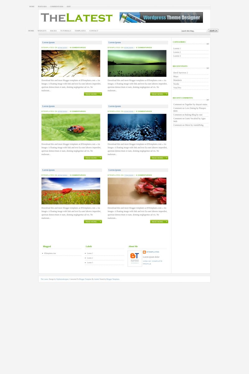
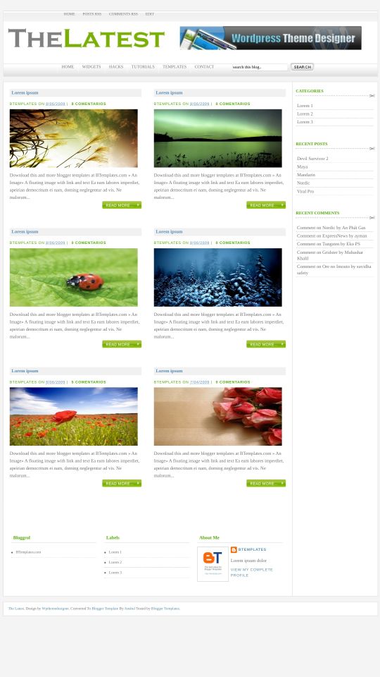
Introducing The Latest, a free Blogger template originally designed for WordPress featuring 3 columns, magazine-style layout, right sidebar, post thumbnails and neutral palette
More Magazine Blogger templates:
Credits
Author: Anshul.
Designer: WP Theme Designer.

Angel 9 August 2009 at 2:49
awesome
jack 10 August 2009 at 20:56
how to use the “read more” features?
please help….
Claudia 10 August 2009 at 22:14
The read more feature is automatic. That means you don’t have to do anything.
Jenn 11 August 2009 at 20:27
I tried editing the header, but it didn’t look right….
Anshul 11 August 2009 at 22:23
Just edit header directly from layout as in headers section widget.
John 12 August 2009 at 19:58
how do I do so that it does not change the size of the image?
Anshul 13 August 2009 at 3:57
Just add it directly from header widget in layout where you write title and description , just upload image from header from there.
Dony 14 August 2009 at 23:18
How to change headers ?
Anshul 15 August 2009 at 7:28
Just download template from here Download Latest Template
As its updated without errors now.
Mas 16 August 2009 at 22:59
Just uploaded,TQVM…so sweet=)
philipphuc 17 August 2009 at 5:13
yeah! nice themes.
Kevin 19 August 2009 at 5:48
Very nice template and great job!Big thanks! BUT I don’t understand something.
When you click on the button “read more”, you go to another html page.
On this page, the font and the colour of the text is totally basic and different from the original page. Is it possible to keep the same font and colour? How do we change that in the html code?
I’ve tried to find the solution for 3h but couldn’t. So, I ask you the question…
Claudia you are the master.
RanjiX 21 August 2009 at 5:28
The heading is fixed and it wont change its place when you change the screen resolution. How can i fix that???
Anshul 21 August 2009 at 15:53
@Kevin just check the demo blog from my template instructions page there you will find no change and just download it from that page as its updated without any errors.
@Ranjix ya its an error in it and to get correct codes just dowload it from template author instructions page where its all updated codes ,then you will get no problem.
And Thanx for your nice comments friends !!!
You Can contact me on my site for any help related to his template ..
http://www.anshuldudeja.com
Narutopedia Layout 24 August 2009 at 23:17
perfect blog for personal photography, nice..
Fernando 27 August 2009 at 17:30
waaaaau (…sorry..i speak english very bad)
Excelent theme!!! awesome!!….i would like that others themes from http://www.wpthemedesigner.com/ could use in blogger
Regards
Anshul 28 August 2009 at 12:18
I had one more conversion from there theme is emperors.
Check it here.
http://www.wpthemedesigner.com/2009/06/28/emperors-theme/
Will release soon.
rick 3 September 2009 at 16:52
I would like to ask how to edit the template. I just wanted to change the view of the home page as you can see an image the below to it is a text.
But my question is how can i edit the template instead of this one with the text, all i wanted to see is the image.
Sam 3 September 2009 at 21:13
Hello Anshul
I downloaded the template and then uploaded the image. But it is not showing in the header. Moreover, I just put the text, but still it doesn’t show up in the header. It is completely blank.
I hope you would resolve this problem out soon/
Thanks
Anshul 4 September 2009 at 5:24
@Rick for this you have make all changes in autoamtic read more hack installed n template.Just read about the automatic read more hack with thumbnail.You can get link o it from template instructions page,then you will undedtand how to vary text and image of post.
@Sam i dont think there is problem like this , or just try template code by downloading from my link as its updated.
Sam 4 September 2009 at 12:59
Hello Anshul
This is my blog.
But as you can see, the header is blank. I went to Page Element- Header- Edit and typed the title “Daily Poops” but the header its not showing any text.
:(
Sam
rick 5 September 2009 at 9:23
hi anshul
i understand it already but got another question my content is uneven.
Anshul 5 September 2009 at 13:15
@rick just show me the demo buddy as without seeing how can i suggest.Just show me what problem is.
Sam 5 September 2009 at 21:06
well, I changed the theme because I couldn’t figure out what made the header text invisible even though I have downloaded 10 times.
Anshul 8 September 2009 at 7:17
Sorry friends for the problem you are facing with template as many are not able to show text in header in this template.
As image is working fine and by mistake i didn’t checked for working of text in it.If you are using image its ok.But if you wanna use text.Just find the css for #header in codes and remove the below property,that i forgot to remove at time of conversion.
text-indent: -9999px;
now remove it and save it and you are done to show text n header.
Eunha 14 September 2009 at 21:16
Hi anshul! I really love this template, but I’m one who loves big banners! How can I change the header to about the width of the whole menu and with a bigger height?
I really don;t need an ad on the right so how can I delete that and just have a big banner on it? Thank you so much~~
Ryan 15 September 2009 at 1:30
Anshul, this is a great template. I absolutely love it. I do have a question for you though. I downloaded the newest version of “The Latest” and uploaded it to my blog. Everything seems to be working great except on the home page the date is behind the title of the post. It is being cut off by the grey box that include the title of the post. Do you have any ideas to fix this? thanks!
Anshul 16 September 2009 at 6:10
@Eunha Just find below codes and delete them.
<div id=’header-right’>
<b:section class=’crosscol’ id=’col1′ showaddelement=’yes’>
<b:widget id=’HTML1′ locked=’false’ title=” type=’HTML’/>
</b:section>
</div>
Now find these codes
#header{
clear: both;
float:left;
width: 408px;
height: 74px;
outline: none;
margin-top:20px;
margin-left:5px;
}
Increase its width to 960px to make your header banner big.
@ryan i would say to remove date option to show off in this template to make this template work properly as using date make post sections look uneven on home page and destroy its beauty.
eunha 19 September 2009 at 12:03
thank you so much!!!! but i ahve one more question.. can the height of the banner be changed? i’m trying to tweak it but it looks weird…
Jalan-jalan 21 September 2009 at 3:16
I tried with Photoplus, it worked well but it too complicated to post the image since we have to use third party for it. so i decided to use this one and just change few things. i even changed the background and header background from other tamplate which is suit to the colour.
Totally gorgeous!!
Thanks alot
Thierry 22 September 2009 at 16:46
Hey Anshul !
Thanks for this great template ! I’ve just one problem : my header is perfect with Internet Explorer, but is too low with Firefox or Safari : it hides the top of my submenu… I’ve tried to change the margin-top value, but when it’s ok for Firefox and Safari, it’s obviously too high with Explorer. Do you know something about that ?
Thanks,
Thierry
ASH 22 September 2009 at 18:31
The pictures are stretched especially the portrait pictures and the video post wont show untill you click read more
could you please help me on this thanks.
billie 23 October 2009 at 17:02
hey ashnul. great stuff!
but im really sorry to be a bugger… the bottom bit (blogrol, labels , about me) and the right column (categories)…doesn’t pop up :( any suggestions advice? much appreciated..
thanks heaps!
Anshul 24 October 2009 at 6:19
@billie just used the template from my download link. As fixed all issues later.So from above download link you will get errors.Just download from my link and update your xml,it will be ok then.
billie 26 October 2009 at 2:41
got it – thanks heaps ashnul!
Misty 29 October 2009 at 23:33
I’m working with this template on my test blog first, so you won’t see it at my above link just yet. Is it possible to change the color or the “read more” button? I’ve been able to adjust all other colors to my liking. Great template!
Thierry 5 November 2009 at 13:18
Hey Anshul,
Any idea for the header problem I mentionned above ?
Darke 6 November 2009 at 2:20
it’s look nice to my blog going to download now and then i will try to edite the hedaer wait for another reaply.
Anshul 8 November 2009 at 2:54
@misty read more button is image just make image of the color you want change its url in codes.
@thierry might be little margin properties difference i.e compatibility with diff browsers.Sorry for it as i didn’t made this template perfectly compatible.
Jason 26 December 2009 at 8:54
Is there anyway to change the background color. Not where the post are located but the outside the outer wall. I tried but couldn’t find it. Well i did find the <outer wall text and i added an image but only the right side took and it seperated my post from the sidebar. Any help would be great thax.
Anshul 27 December 2009 at 2:40
@jason you can change all outer color from here
body {
text-align: center;
font: 12px Verdana;
color: #727272;
background:#f4f4f4;
padding: 20px 0;
}
And its very anoying to say and answer you as you have removed all footer credits from template,its not good.
Jason 7 January 2010 at 16:15
Hey thax but that didn’t work. But i deleted the credits by accident i was trying to edit the name of the blog sorry. But what i wanted was to put a background picture instead of the white color not under the main post area or the sidebar area where the labels go either but outside these 2 i guess the left and right. I tried what you said but that didn’t work. Thax again. Sorry again.
Anshul 7 January 2010 at 19:54
@jason its the background color u saying background:#f4f4f4; change it and for image use like this background:#f4f4f4 url(image link);
Jason 8 January 2010 at 4:17
Hey thax so much it worked. I tried doing the same thing on your other template called Pin Up and it seems that there isn’t a way to do this on that template at all. Thax again.
Tom 26 January 2010 at 11:39
How i can add support for Internet Explorer ?
Tom 26 January 2010 at 11:47
How i can edit this template to be compatible with Internet Explorer ?
Anshul 26 January 2010 at 13:51
@tom i made ir compatible to internet explorer 7 and 8 afterwards when problem came.I think above download link is not updated.Just download template from my template settings page above again and update yours.That might be problem.
Tom 27 January 2010 at 6:43
@Anshul My Problem with Internet Explorer 6 ..
Please i need this template to be compatible with Internet Explorer 6,7,8
Thank you
Anshul 27 January 2010 at 7:21
@tom sorry we dont consider ie6 for compatibility in designs.And above design is compatible with ie 7 and 8.
And also use updated xml from my link as above is not updated.
Tom 27 January 2010 at 8:44
@Anshul Please can you tell me how using CSS to add compatibility for IE6 ?
Tom 29 January 2010 at 23:33
Hi Anshul
Please tell me how i can replace or change the green button “READ MORE ..”
Thanks
Zafiro 31 January 2010 at 20:31
I’m trying with this layout, but the image of the banner, keeps going low, and my nav bars go to the left, the search thing moves around my menu :S
I dowloand from your link, but dosent work T_T
Mosaico 7 February 2010 at 9:53
Hi, this is a great blog template, but I have a little problem… I really want the labels to appear in the post footer. I think it should be this piece of code to put somewhere, the problem is I don’t know where (I tried to put it in many places without any result.) :
,
Any idea? Best Regards
Shawna88 10 February 2010 at 20:08
Love this awesome template! I need to solve the problem with the photos stretching on the home page. They do not stretch on the other pages. Can you please let me know how to fix this? Please let me know IN DETAIL as I am not a very good HTML person and would need you to tell me exactly how to fix this because I am not experienced.
Also – is there a way to make sub categories beneath the categories? Thanks.
As you can tell I need to do some work on the Header also, but this is a start. More important are the pics on the home page.
Thank you for your kindness in helping me.
Best,
Shawna
Anshul 12 February 2010 at 14:51
@shawn control image size with these values in codes
img_thumb_height = 150;
img_thumb_width = 330;
and pleae update template from my download link as its not updated.
Scott 10 March 2010 at 11:30
Love the template – VERY NICE!
Could you tell me how I change the size and colour of the text though as it doesnt change through ‘fonts and colours’.
Cheers very much!
April 23 March 2010 at 13:23
Great template!
I would like to use a full size banner with no ad on the right. I followed your instructions given in response to Eunha, however, I am experiencing an offset (banner doesn’t fit up to the bars and runs over the submenu) full size banner. How can I correct this? Should I revise the code or my picture? I have tried both and been unsuccessful.
Also, is there a way to change the color of the SubTitles for the different sections (.e.g., Followers, About Me, etc.) to another color besides Green?
Thanks,
April
jimmypage 18 April 2010 at 18:58
awesome but seem difficult to change the header, right ?
10zen 4 August 2010 at 2:06
Hello! This is a nice template. Thank you for this. But I don’t need read more feature. I removed the read more link, but like in the demo, in home page it still shows short version of the post. How to make it like normal post?
Halil 25 September 2010 at 20:17
Thank you for this beautiful theme, first
I think I made a mistake on the home page setting, only 1 subject seems to change its still a piece does not change how you do it more precisely to alter Thank you for your help