Smash Magazine Blogger Template
Instructions
About Smash Magazine
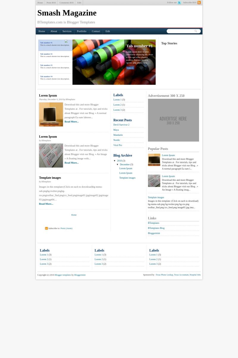
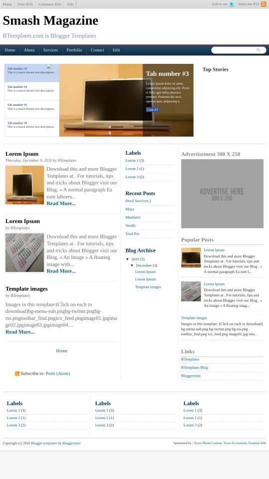
Introducing Smash Magazine, a free Blogger template featuring 3 columns, magazine-style layout, right sidebar, ad-ready spaces, multi-column footer, image slider and post thumbnails
More Magazine Blogger templates:
Credits
Author: Bloggermint.


Franklin Manuel 9 December 2010 at 21:44
Hi,
I guess something is going wrong with the popular post on the right side of the featured slider.
Hope you guys look into that
Claudia 30 December 2010 at 13:00
Para configurar el slideshow es necesario ir a Diseño/Edición de HTML y encontrar el siguiente código:
Ahí sólo es cosa de reemplazar las imágenes, las URL y las descripciones. Cada imagen debe tener 490px × 265px.
rains 3 January 2011 at 18:55
hey guys um not sure if you notice but english is the preferred language around here i’d love to know what you said above :)
Claudia 4 January 2011 at 1:29
@rains: Yes, but if anyone asks in spanish, I must answer in spanish. If you have a question, please let us know.
The code above is for changing the images and texts of the slideshow.
rains 4 January 2011 at 2:22
Thank you,
And yes i agree Spanish is such a nice language, am i able to get smash magazine customised for a PRICE? I love the template but it has so many flaws at a glance there are 2 nav bars that do nothing and aren’t editable, images i had with my posts are now distorted within the column, I’m a writer and need things to be seamless. font and colour control across the template would be nice or at least a better fixed set of fonts.
“I shouldn’t have to dig into the code to add or update content thats ridiculous”
if anyone can help please let me know.
rains
rains 4 January 2011 at 2:31
Hi Franklin Manuel,
can you help me please i need smash magazine customised pronto as my blogs live and it looks really bad. name a price.
rains
rains 4 January 2011 at 2:46
Ideally I need to be able to swap out content from both header slide boxs easily as i would do this 2-3 times a week.
I’d like a new set of fonts 3 to be exact and a set of colours 6 to choose from.
I’d like the nav bars gone but would like to keep the search bar, also the twitter logo top right which i can’t even access has to go as well unless i was able to link my acc to it then it can stay.
I’d like standard width control for blog and sidebar, the layout is fine. I’d like to be able to add more widgets in design mode. if it helps anyone i can supply a preview of what i’d like smash magazine to look like.
thanks for reading
rains
Benet 4 January 2011 at 6:40
Gracias por tu aclaración Claudia. I change my language in order that everyone can understand.
I agree with rains that we shouldn’t dig into the HTML code. Sure that have to be lot of people (bloggers) that don’t know how to manage with that.
Is it possible to add an slide without having to be changed? For blogger users (wordpress users don’t need to do it)
Thank you
Claudia 4 January 2011 at 8:49
Guys, If you use Blogger you must accept that you need to change the images by yourself, because Blogger won’t make it automatically. Unfortunalety, Blogger is not WordPress.
Mia 6 January 2011 at 13:33
This is one of the best templates I’ve seen, and I’ve viewed a lot. Everything’s there to make the blog what keeps people coming back – content rich. I’m using it for my new e-zine. Would love to see this same format in a variety of themes.
Rory 9 January 2011 at 18:24
This is a great template but I can figure out why every picture I put in the slideshow either doesn’t resize out, or in. I even used all the same specs for one of the pictures that this code is directed to (hight, width) and the picture still came out WAY oversized, and then the next (slide #2) was tiled.
I noticed at the end of the first image src of the slide show this placed in after the title:
width=’540px !important’
that code is only include in the first picture of the slideshow section of the html. Any help would be great. Thank you.
Franklin Manuel 10 January 2011 at 9:33
Hi guys,
If you have any issues with the template, drop in your comments here, so that I can help you out.
http://www.bloggermint.com/2010/12/smash-magazine-blogger-template/
Paula 4 March 2011 at 21:10
Hi there
I downloaded this template, and despite knowing nothing about html, I’ve managed to get most of it working. The only thing I can’t see is how to get my twitter and rss feed links to work. I can see the blocks of coding for them, but don’t know where I should put the links within those.
Any help would be really appreciated.
Claudia 5 March 2011 at 20:29
@Paula: Go to Design/Edit HTML and find this code:
In the Twitter code, you must replace:
(replace it by your Twitter username)
In the RSS code, you must replace:
by your RSS Feed URL.
Paula 6 March 2011 at 3:28
Aah, thank you so much! I couldn’t see for looking! Everything’s working now and the template looks fantastic. Thank you!
Dawn 16 March 2011 at 9:13
Hello,
I really like this template and would like to use it on my oldest blog. It is one of the only blogs I have that has a blogger default template. I have been worried about changing it as it has over 100 posts and a lot of various things. Will changing the template make me lose stuff that I have on my blog already? All of my other blogs started out with a customized template so I am not sure what to expect.
Thank you
Srinivas Narne 10 April 2011 at 4:48
I’m current using this template for my blog. But in the featured posts slide show, the arrow mark which is to be on the right the featured post title is broken. Please replace it with a new image.
Lin 11 June 2011 at 20:17
Hi there seems to be an issue with the template. I downloaded and even in its default setting some of the gadgets are not lining up right. There sems to be an issue with the TOP STORIES gadget, it over flows into the slider and above the top of Navi bar so everything in those areas looked mixed up. Any advice on how to fix this would be great.
Thanks
the quest boi 9 August 2011 at 2:57
hello i was kinda editing the topnav bar where Home, About, Services Portfolio, Contact, Edit.
here’s my question, if i put my pages on the said Categories it will be display on the main-wrapper how could it be shown without the Read More.
it will look like
Portfolio
this will display all the portfolio in line items
___
___
___
___
Read More…
it should be more line
thank you franklin
Chaz 9 September 2011 at 12:09
Within the image slider there is a broken image icon. Its on the demo. and its on mine, how do I fix it?
Chaz 9 September 2011 at 12:12
@Lin:
the top stories feature takes a while to actually work. I waited about a month and it just showed up.
Muhammed 16 September 2011 at 17:17
hey guys, I installed this template and I see that It’s awesome .. but now I face a problem that all my google adsense is not running as before, als the comments there’s no place for comment on the posts .. so dunno what’s the problem .. please I need help :)
Sergio 13 December 2011 at 18:01
There is something miss on the sliding
please review this
Gnanaprakash 16 December 2011 at 19:57
@Srinivas Narne: srinivas, i was setting up my blog now but i am facing a problem with the search box. It is floating.. Just have a look on my blog. Can u help me on solving this issue. Is there any clue on the slider image (arrow left.png) .issue