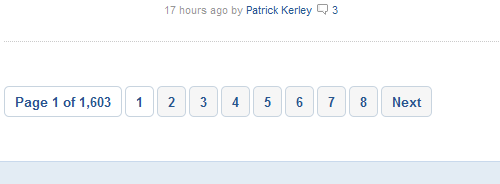
The navigation bar (Next page link, previous page link or pagination) is one of the most important elements of a web design. A well-designed navigation bar allows user to turn the page on an almost instinctive way and invites him to continue reading.
Reviewing the top 100 blogs of Technorati (yes, it’s still online) I present you a few that caught my attention to find some good and bad practices.
Showcase
Mashable
Mashable.com has a pagination, with numbers in big and clickable containers. Has links “Next” and “Previous” but not “Last” and “First”, which, in my opinion, are rarely helpful.

Engadget
Engadget.com has a clean and easily recognizable navigation.

Celebrity Gossip
Tmz.com has a recognizable navigation and also invites to keep reading.

The Daily Dish
In The daily dish seems that they are not interested in that we continue browsing with their discreet navigation bar.

ReadWriteWeb
In Readwriteweb.com the pagination numbers are confused each other. It’s hard to click on each and is even, is difficult to distinguish between navigation and content.

Popeater
In Popeater.com the navigation bar has enough space and its function is unmistakable. Another interesting point is that all navigation links are using the same color, a different color than the color of the content.

Politics Daily
Politicsdaily.com also an easy to find navigation bar.

Slash Film
Slashfilm.com well as the classic “Next” “Previous “, has a banner, but for its size, it can be confused with advertising.

The Next Web
Thenextweb.com has a minimalist and elegant navigation bar, suitable to its design, but may go unnoticed if you’re not looking for it.

Joystiq
Joystiq.com has two buttons in enough space. No need to search them if you want to read more.

GigaOm
Gigaom.com has a good combination between the simplicity of the “Next” and “Previous” buttons and the information of a pagination.

Neatorama
In Neatorama.com they show if the next page contains newer or older posts.

Daily Intel
In Daily Intel they add a link to the home page in the navigation bar.

Conclusions
Conclusions based on my user experience in these blogs are:
- Navigation links must be clearly distinguished from content, by color, design, size, space or any other property.
- Within a pagination, the Next / Previous buttons should be highlighted.
- In pagination numbers, its whole area should be clickable.
- Use “previous articles” may be more informative than “next page”, since the latter doesn’t report the age of the publications.
- In some cases, is a good idea to put a navigation bar at the beginning and end of the page.
With it exercise, I have found several points to improve in my navigation systems. Do you find something to improve on yours?
Delicious Design Studio February 20, 2011 at 12:54 pm
The idea of placing a navigation bar at the bottom of the page is a good one. I think I’ll take into consideration.
Thanks.
Delicious Design Studio
harsha March 4, 2011 at 7:12 am
Hi Guys,
I recently uploaded an template from BT, now the problem is when i click on RSS feeds its opening with some html page, would require an help to rectify this,
thanks in advance..