Ferias Blogger Template
Instructions
About Ferias
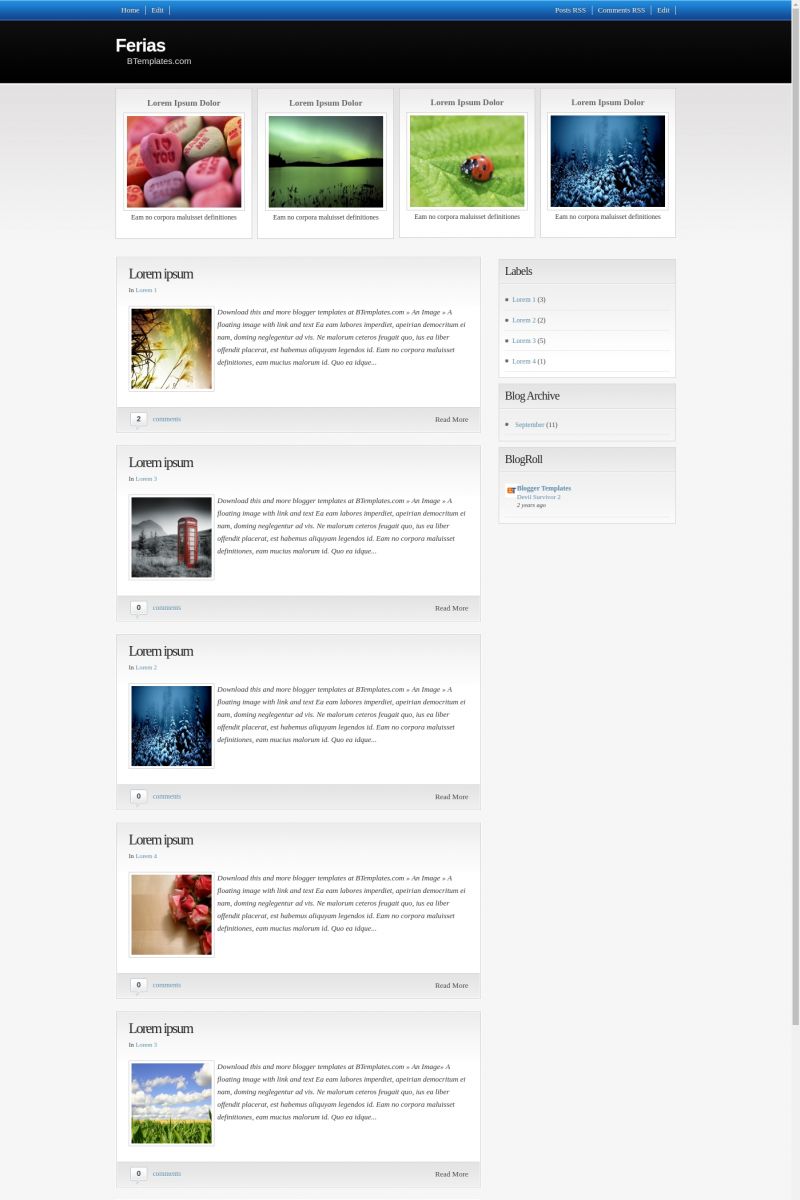
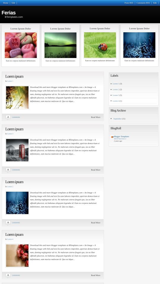
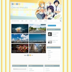
Introducing Ferias, a free Blogger template featuring 2 columns, magazine-style layout, right sidebar, post thumbnails and neutral palette
More Free Premium Blogger templates:
Credits
Author: Templates Novo Blogger.




Kemal 24 December 2009 at 16:17
Tnx.!! Good Theme.
Claire 28 December 2009 at 2:48
How do you get rid of the after the jump feature in the html?
Francesco 8 January 2010 at 18:42
It´s impossible to move the widgets, the template is good, but it has that mistake …
Zahra 11 January 2010 at 23:46
Hello! I was just wondering what size the pictures have to be to fit perfectly in the squares (the 4 top pictures) thanks!
Miles Greb 15 January 2010 at 2:33
I can’t get the image links to works for some reason.
Alicia-Marie 18 January 2010 at 9:44
Is it possible to change the background color? I looked for the place within the html code but I couldn’t find where.
Otherwise, its a great design. Thanks.
Vefâ Arşivi 30 January 2010 at 15:37
Hello.
Beautiful..
Thanks.
dervisblog 9 February 2010 at 17:39
oh my God. it’s verygood template thanks bplates and very thanks
templates para novo blogger
Marie 10 February 2010 at 21:19
Great Template! Thanks for sharing
milleo 16 February 2010 at 15:16
the post photos don’t have the normal proportion… if you fix it, i think it was be a great template
pabela 21 February 2010 at 12:07
Yeah it’s impossible to move the widget which is rather annoying as far as I can see I’ve downloaded lots of templates and none of the widget could be moved! Why’s that? Is it something reggarded to blogger itself or is it the templete design? I feel rather frustraded as I’ve asked many times but nobody answers! and Arianne, the designer has no comments possible on her website!
mosi 1 March 2010 at 7:57
Great template……..i pay my thanks to developer
Max Goh 12 March 2010 at 1:48
hi there, do you have red color version of this template? hehe or is it possible to create a red color one? tq
rays 25 March 2010 at 5:55
I Like this…tks
mfi 28 March 2010 at 15:55
Alicia-Marie you asked if there was any possible way to change the background color if you meant the top of the blog that is blue then yes there is a way.
if that’s the part you are talking about.
after you downloaded the ferias folder and extracted all the files there would have been a folder titled backgrounds in there it has 5 background colors but the background are for the nav bar (The blue part on top).
what you would need to do is go to a place where you can upload the background where they will give you a url to the background I used http://photobucket.com here’s the links to the background I have already uploaded.
the first is gray
https://i821.photobucket.com/albums/zz139/myfavoritereviews/gray2.png
second is another gray
https://i821.photobucket.com/albums/zz139/myfavoritereviews/bg-gray.png
the third is a blue
http://i821.photobucket.com/albums/zz139/myfavoritereviews/bg-blue.png
the fourth is green
http://i821.photobucket.com/albums/zz139/myfavoritereviews/bg-green.png
the fifth is pink
https://i821.photobucket.com/albums/zz139/myfavoritereviews/bg-pink.png
just copy a code and past it into your layout>edit html
#navbar-iframe{height:0px}
body {
background:$bgcolor url(https://i821.photobucket.com/albums/zz139/myfavoritereviews/bg-pink.png)
find this code and put the link here url( link ) then it should change the color of the top nav bar for you sorry I don’t know how to do much more just started using this template today if I find out more I will let you all know.
if you don’t want to use my links you can go to a free photo hosting site called photobucket and sign up for free and upload the picture from the ferias background folder there and just copy the links and place it in the code like above.
Lis 18 April 2010 at 19:20
I love this template! Wish I’d read the comments though, would have saved me the time I spent figuring out how to change the header colour ^.^
It’s a very clean and tidy template which is easily edited to give it your own personal touch. Double thumbs up from me <3
dao 4 May 2010 at 14:43
I have a question…how can i set up the main page to show posts around 15 posts on main page…
I set up on setting but not work,,, how can i do
Please help me
Thanks so much
Bliser 5 May 2010 at 8:42
exelente plantilla, me servirá para mi blog de descargas ^^!
Travelphant 10 May 2010 at 16:00
Hi, I have the same question as Dao on 4th May. My blog only shows 4 posts on the homepage when i set it to 12 posts in settings. Please Help?
Claudia 10 May 2010 at 18:20
Travelphant:
Many people is having the same problem than you. The easiest solution is to get rid of the heaviest javascript elements which make to your blog loads too slow. You can also consider to optimize your pictures for web (eg. you can reduce their size and weight).
Travelphant 11 May 2010 at 3:10
@Claudia:
Which javascrpit elements do you recommend removing? You say optimise the pics – is there a file size limit to the homepage?
Julieta 14 May 2010 at 15:12
Hola a todos. Tengo un error en mi blog. En la función de paginas el texto no se ve completo. Me di cuenta que agarra el estilo de las entradas de la página principal y se ve incompleto. Espero que puedas ayudarme a corregir el código. Gracias de antemano
Luxury Cornwall 17 May 2010 at 4:55
Hi there
How does search spiders read the blog description on this template as since I have updated my blog to this template, Google now has a different description in search results.
Can you tell me where in the code I should put the description so Google can correct it?
Thanks
Cam
laura 19 May 2010 at 20:52
beautiful! I am able to embed a google calendar in a sidebar widget, but not in the main portion of a “page”. I suspect this might have to do with the jump function, and I would also love to know how to turn this (jump) off…or any other tips on why my calendar might not work. thanks!
Bridget 4 June 2010 at 14:42
I love the template – but when I have a go at loading it I lose all my followers: and they are my greatest asset! Any ideas?
parisa 11 July 2010 at 3:49
hi all..
can someone please let me know how to fix the “Comments RSS” button on top right. If you go on my site and click on that, you will see what I mean.
Thanks
Claudia 11 July 2010 at 17:23
@parisa You can find the answer to your questions and more in our FAQ section.
Mimi 11 July 2010 at 15:41
Hello, how did you change the color of the header where it says the title of your blog?
Thanks!@Lis:
Claudia 11 July 2010 at 17:19
Find this image url (in Design/Edit HTML) and replace it by yours:
You may edit the black part and upload it again. You can also read the "Template Settings" ;)
Devartz 16 July 2010 at 10:29
great job . . can i ask, how i can change the logo ? because i want use my logo image . .
best regards
thanks
devartsdesign
Claudia 16 July 2010 at 14:26
@Devartz: Go to Design/Page elements/ Header and upload a logo image from your computer, always selecting the option “Pacement -> Instead of title and description”.
Devartz 16 July 2010 at 14:47
@Claudia:
thanks claudia for tutor . . problem solve, i can change the logo :)
nice to meet you :)
best regards
Sofia 20 July 2010 at 0:55
hi..
how can i use PAGES in your template..
the text cant expand.Tq..
chanda 23 July 2010 at 12:16
I am not understanding how to change the images…I have tried to find the info on this all over the place so I didnt have to bug anyone (and the ones I can find are not in English for me to read)…I have also tried playing with html (which I am not a pro at) and still cant get it to work…I really like this template and I dont wanna change it….can somebody please help me?
Chanda 23 July 2010 at 15:41
never mind…I found it
Claudia 23 July 2010 at 21:03
@Sofia: Go to Design/Edit HTML, click on “Expand widget templates” and replace this code:
by:
Save your template. Does it work?
Jonathan 31 July 2010 at 8:33
Thank you very much for this wonderful template but ….
What is the part and how I can change the text of the entry of home?
Capture: https://lh6.ggpht.com/_55Jr-DolIFA/TFQlmXGQBtI/AAAAAAAABmg/tAhoGv-kKis/capturada.jpg
girl_sexy 9 August 2010 at 0:31
thks b4………. :o
rebecca 11 August 2010 at 13:44
@Claudia: How do you expand the blue and black color of the header? It appears as though all of the blue color is hidden.
Starr 24 August 2010 at 18:03
This is the best template I’ve seen for what I want in a LONG time. I even put off building a new site for months because I wasn’t happy with anything else I had seen. It is extremely easy to set up and customize, with some CSS tweaks. Kudos to you for this template :)
kissu 26 August 2010 at 20:22
Anyone know how can I add links in the space “related posts”????
thanks
Claudia 28 August 2010 at 0:32
@kissu: Links are displayed automatically with javascript. So, you don’t need to do anything.
PB 21 September 2010 at 8:02
Hi, I love this blog and I choose it for my blog on Blogger. But I’m a real dummy and I dont’ understand how to put posts and pictures on the 4 “windows” under the title… Can somebody help me?! :)
Claudia 24 September 2010 at 15:32
@PB: Go to Design/Page elements. You will find 4 image gadgets where you can upload your own images from your computer.
Starr 24 September 2010 at 17:01
Hello,
Wonderful layout by the way :) I am having one problem I can’t seem to fix though. When I post a link on my Facebook page, instead of the first paragraph coming up next to the thumbnail, this coding comes up instead. I can manually change it but anyone else posting will have the same problem. I am lost on where to fix this within the template. This is the coding that comes up:
‘); if (r ‘); } //]]> var thumbnail_mode = “float” ; summary_noimg = 440; summary_img = 360; img_thumb_height = 140; img_thumb_width = 140; // // function removeHtmlTag(strx,chop){ if(strx.indexOf(”
Can you please tell me where to go in the CSS to fix this and what the correct coding should be. Thank you! :)
PB 4 October 2010 at 10:35
@Claudia: thank you very much! :D
marcia parra 5 October 2010 at 16:48
hola
Me encanta esta plantilla, pero quisiera poder ampliar la cabecera, porque abajo del titulo necesito poner una descripción del blog.
Lo he intentado, pero sólo logro ampliar los cuadros de botones.
Ayúdame por favor.
Tienda erotica 7 October 2010 at 6:47
Sin duda alguna es un gran template, lo he utilizado en algunos blog, lo unico que encuentro que el codigo no esta muy limpio.
Pero en lineas generales es bueno.
;)
SC 11 October 2010 at 8:21
This template is great. Two questions.
1) I have linked the four images on the homepage to individual pages. But the pages do display properly. The excerpt of the page (the first five lines) is shown at the top of the page, so it is actually repeated. How can I correct this problem?
2) The thumbnails on the homepage are distorted. Can I fix this problem without changing all the original images into squares?
Thanks for everything.
Tecnomania 28 October 2010 at 16:10
I have the same problem as Starr, when I post to Facebook I get the follopwing code:
); if (r ‘); } //]]> var thumbnail_mode = “float” ; summary_noimg = 440; summary_img = 360; img_thumb_height = 140; img_thumb_width = 140; // // function removeHtmlTag(strx,chop){ if(strx.indexOf(”
Can anyone help us this looks terrible.
Starr 28 October 2010 at 17:41
Tecno, I still don’t know the changes to make but you can make it look better it Facebook. Just click on the coding text in the FB box, delete and then copy and paste from your blog. As you have the exact same code showing up, I’m wondering if the …. ); ….. before the if is what’s messing it up.
Claudia 28 October 2010 at 21:58
@Tecnomania:
Go to Design/Edit HTML -> Expand widget templates and find this code:
Now replace it by:
Tecnomanía 29 October 2010 at 11:55
Dear Claudia, thank you so much for your prompt answer. When I expand the widget template I get the following code:
Parisa 29 October 2010 at 23:57
Hi
Can someone please tell me how to replace the “Comments RSS” code. It used to work for me, but obviously i did something to mess it up because now, it’s just a jumbled pieces of code instead of the actual comments.
Claudia 2 November 2010 at 19:13
@Parisa You can find the answer to your questions and more in our FAQ section.
Parisa 2 November 2010 at 22:59
Claudia–I really cant find the answer in the FAQ…can you please let me know exactly where. This was my original question. THANK YOU SO MUCH!!
Hi
Can someone please tell me how to replace the “Comments RSS” code. It used to work for me, but obviously i did something to mess it up because now, it’s just a jumbled pieces of code instead of the actual comments.
Claudia 3 November 2010 at 8:21
@Parisa: 4th question: “How can I edit the menu of my template?”
Parisa 3 November 2010 at 14:06
THANK YOU! It worked :)
aires 1 December 2010 at 21:35
Hi Claudia, really nice template, thank you.
i have the same problem of SC (11 oct), individual pages have repeated text at the top. How can i fix it?
thank you so much.
Claudia 3 December 2010 at 19:08
@aires: Please, leave your blog link when you comment, because I’ll need to check what is going wrong. Realize that this template was created before the pages feature was implemented in blogger templates.
Julieta 6 December 2010 at 14:32
@Claudia:
Claudia what’s happend whit the image http://i38.tinypic.com/12164nl.png
i see it doesnt exist now… i didn´t copy the img, ¿could you please send us the image again? Tks
Claudia 6 December 2010 at 18:14
@Julieta: Which image is that? This template does not contain any template hosted in tinypic.