Pin Up Blogger Template
Instructions
About Pin Up
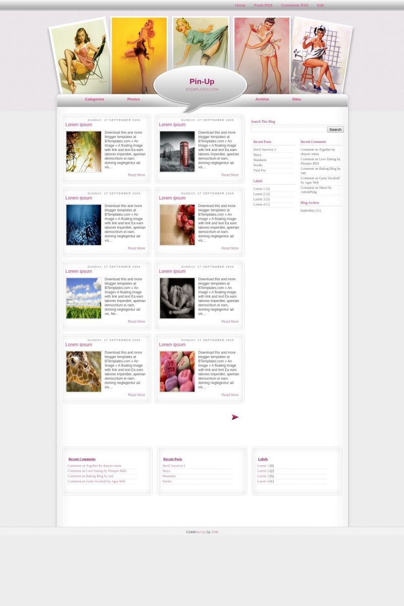
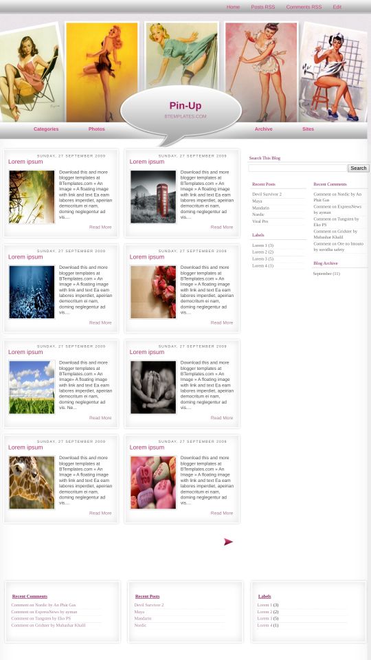
Introducing Pin Up, a free Blogger template featuring 4 columns, right sidebar, post thumbnails, feminine aesthetic and vintage aesthetic
Perfect for blogs covering art, personal journals or people.
More Art Blogger templates:
Credits
Author: Templates Novo Blogger.

Jason 27 December 2009 at 19:14
This is stunning. Thax a lot. Its beautiful. I hate to ask this because it is stunning but is there any way to change the pics of the girls. Thax.
Julieta Saravia 29 December 2009 at 20:16
Hey, how can I edit things? I want to delete the theme because I can’t use it, i’m going mad! Please tell me, i can’t edit anything!
Jason 31 December 2009 at 2:37
What do you mean you can edit anything? You mean the pics at the top of the girls or you just can’t edit anything in the page at all?
Timothee 3 January 2010 at 18:12
You can pretty much edit anything you want. you just have to know where to go.
Tina 5 January 2010 at 10:41
I like the look of this. Is their a way I can change the header? Instead of pin ups I’d like to add images from my blog.
Jason 7 January 2010 at 11:38
I don’t think you can tina. I tried removing the header and it remove everything the picture borders and everything. So i dont think you can unless you just make a collage of some sort and put it up there.
DaoStudio 10 January 2010 at 4:45
Oh wow! this is very nice….I want to try this one.
Shanna 11 January 2010 at 20:38
I love this template! One question though: Does anyone know how to change this?
Instead of “Related Articles” or somesuch, it has the spanish, Artigos Relacionados. I’d like to just switch it to English, but I can’t find it in the template/html. Any help appreciated!
Thanks!
Jason 12 January 2010 at 7:58
Its very easy Shanna all you do is go and open the html i think you click expand widgets just click on it to make sure. Then what you do is you bring up your text finder for example on a mac is option plus f. Then you type in artigos and walla it will bring it up and then you can change it by clicking on it and erasing it and typing related articles. Sorry that was so long hoped it help.
Jason 12 January 2010 at 8:02
Does anyone know how to put a picture in the background?? I just cant seem to find out how. If i put in the top bar it will either go to the left or right but not that whole page. And if i add it instead of the pin up pics it will start low. Thax for any help.
Shanna 12 January 2010 at 11:12
Aha! That worked perfectly! Thank you, Jason!
Claudia 12 January 2010 at 22:35
Thank you, Jason. In any case, I’ve changed the “Artigos Relacionados” text to english in the xml file. So, if you download the template again, now you will see it fully translated to english.
Regards :)
Nat 12 January 2010 at 23:25
Beautiful template! I need help with one thing though
The links above (photos, archive etc) are all relative links. How can I change them to absolute links!
Thanks!
Lisa 13 January 2010 at 2:09
I am pretty new to all of this, so please forgive me if I ask a very newbie question. I like this template a lot, however I am a little confused, about how to add to the pages, which are labeled on the front (Archive, photos, catagerories, etc). How do I go about adding to those pages, and how does it know where to go? Thanxs
Kate 13 January 2010 at 13:36
I tried this template on my blog. I haven’t written anything yet. So, the page is still almost empty. I wanted to post a blog though and I can’t already find my way back. >_< I can't even go to my dashboard. I can't go anywhere else. Thanks for helping this newbie. (^_^)
Claudia 13 January 2010 at 17:09
Lisa:
Find these lines and put your links there:
Kate 14 January 2010 at 2:27
By the way, I didn’t download the template. I just copied and pasted everything in that big box. The template was from this file: (something.xml). Can this be the cause? How can I go back to my plain and original template? Thanks again! (^_^)
Jason 14 January 2010 at 9:50
Your Welcome Claudia and Shanna
Tennie 16 January 2010 at 23:59
Thanks for a beautiful template. Love it!!
Valéria 20 January 2010 at 8:08
Eu gostei muito.
É leve, claro e proporciona um layout limpo e objetivo
Obrigada!
………….
I liked a lot.
It is light and leaves the screen clean and organized.
Thanks!
Ann 25 January 2010 at 11:14
Beautiful ! I love it. I did see your post about inserting your links for the site, photos, and etc at the top of the page. I’m just not getting exactly how to do it. Can you be more specific. Where do we put the link in that line?
Claudia 25 January 2010 at 18:16
Ann:
Go to Layout/Edit HTML and find the lines I said on my previous comment. Then, put your links there.
For example:
In
replace the
by
It's only basic HTML. That links must redirect to an existing post in your blog.
tomo 27 January 2010 at 9:05
this is good yeuhh..
Ann 27 January 2010 at 10:12
Thanks :) !
Eezy 28 January 2010 at 9:32
hi Claudia,
The template is so great for a blog i am supposed to make. But can you please help me how to change the pin up photos? Is it possible to change it to my own photos? If yes, what to look for in the html? thanks so much..
Claudia 29 January 2010 at 18:27
Eezy:
Download this image to your computer and edit in in your image editor. Afterwards, replace the link in your template.
Carla 31 January 2010 at 21:45
Oi Cláudia.
Eu adorei o template, mas queria saber se tem como colocar os posts em uma única coluna, para que ficasse um embaixo do outro.
Obrigada!
Al Hu 7 February 2010 at 21:08
Love the template, but I cant rearrange the order of page elements in the layout.
Thought maybe something was wrong with safari, so i tried firefox, however, I still can’t change anything!
Any help will be appreciated because i really like this template.
BTW thanks for explaining the other stuff, it really helps.
Al Hu 7 February 2010 at 21:14
“Download this image to your computer and edit in in your image editor. Afterwards, replace the link in your template.”
Can you please explain this part also?
Sorry I am new to this
Al Hu 7 February 2010 at 21:32
so i figured it out. Opera lets me do it.
so the other question is the one i need answered :)
Al Hu 7 February 2010 at 21:52
http://bootybanditstreasurechesttest.blogspot.com/
Can you go take a look here. This is where i experiment with the templates before using them on the actual blog.
i downloaded the image and then edited it and then put it up through the “Configure Header” tab in the layout.
But then the image doesn’t sit properly as you can see.
Do you have a solution for this?
Thanks
Al Hu 7 February 2010 at 23:22
OK now i uploaded the image and then replaced the link as you suggested, but it still doesn’t sit right, its slightly too high!!
LivvyLuv 8 February 2010 at 13:14
why are the main links at the top off set from the gray bar? They are below the nav bar.
KIRKY 15 February 2010 at 22:48
Can someone please tell me which part of the HTML I need to edit to change the font for the titles of the blog posts on the home page??
Skinny 19 February 2010 at 5:32
Hi,
Please could you tell me how to increase the width of my posts?
Many thanks.
p.s I love this template!! :)
Nate 20 February 2010 at 19:17
I have tried, but I can’t seem to figure out how to change the color of the links that read “Categories, Photos, Archives,Sites” Can help m here?
Kirsten 22 February 2010 at 7:50
does anyone know why my blog might only be showing 13 posts on the home page? If I increase the amount on the layout editor it does not change, only if I decrease. It wasn’t always doing this but hasn’t changed after I’ve changed anything so I not sure what the cause could be.. see my blog link above.. Is there something in the HTML to edit to fix this as I want 18 posts per page??
K
Jason 22 February 2010 at 12:30
Kristen you change the number of post that show on your page under the settings tab not the html. Settings then Formatting and there you go thats where you change how many post show on your site.
Kirsten 22 February 2010 at 16:53
thanks jason for the reply, i know how to change it but for some reason since yesterday it won’t put anymore than 13 on the page.. frustrating me cos i don’t know why..
ma 2 March 2010 at 14:34
i edited the large header post and it was working fine before, but now when i used photobucket as its host, it brought it smaller than the actual header needs to be. is there any way to fix this?
Claire 5 March 2010 at 6:40
Gorgeous! I’m seriously obsessed with Gil Elvgren and I looove this…. Was wondering if its possible to change the colour of background and bars from grey tho? Sorry if that’s a stupid question, I’m a bit spesh when it comes to tech type stuff!
Talina 5 March 2010 at 15:43
I love this template!!! I need help with one thing though. In blogger I created a new page for my about me, but how do i get the READ MORE button on that page to work? It works when I want to post, but not on the new page….I’m stumped!!! I also tried the ‘jump break’ instructions to no avail!!! Help please!!
Thanks,Talina
MMlove 7 March 2010 at 12:53
Mine more worst…
how come it only showing 5 post in the main page?
Although i changed the setting (formatting) to 8 posts, it can’t work out too! How can I fix this make it 8 or more post in the main page?
rai 14 March 2010 at 5:52
i had changed the header in my blog.
but hten
it can only show 3 posts per page
can anyone help me with this?
when i post the 4th entry,
all the previous entry gone just like dat
Jason 15 March 2010 at 9:07
i just got this glitch as well it now only displays 10 post on the front page but other pages it displays 14. i think that there might be a problem in the actual coding so we might have to wait until we hear from the creator of the blog.
Kirsten 15 March 2010 at 9:19
yeah mine been doing it for awhile i changed layouts.. others that are similar style do the same thing.. its annoying i really liked the format but wanted to have at least 20 posts on the front page.. maybe its a blogger thing… damn it!
Jason 15 March 2010 at 11:17
Hey Kirsten just check out your blog i like it. i tried to post a comment but your word verification doesn’t show up all the way.
Kirsten 15 March 2010 at 18:09
hi jason, that sux i had no idea .. grrr always something that not right with these templates! wanna go back to this pin up one but not until the glitch is fixed..
rai 15 March 2010 at 19:47
i’ve already got mine settled. i guess there’s nutiing wrong wif the coding. its depends on how u set ur display post per page. or i guess its auto depend on the height of your sidebar. put many widget or gadget at the sidebar part, so that it will be longer, thus the post part can be fill wif many post. :D
Jason 16 March 2010 at 3:05
Hey rai anyway you can tell us how you made your header?? I like it because its the original you just change the picture. Tell us how did you do it. Thax. Nice blog btw.
rai 16 March 2010 at 5:22
owh. about the header. u need to edit it in picture editor such as photoshop or others..
u might want to download this:
http://img715.imageshack.us/img715/7343/outertopa.png
put any picture behind it in image editor. save as png type. and upload it to imageshack or any image host. copy the direct link given
open ur template. edit html n rplace this :
‘http://4.bp.blogspot.com/_PQQqUtSbP4Q/SzaAVxMYv3I/AAAAAAAAA80/Aw66WJGPclc/s1600/outer-topA.png’
with the direct link given just now. dats it. :D
remember, when you are editing the header, dun change the image size. :D
dats all~
mya 16 March 2010 at 11:20
hey, I also had a question about adding in pictures on the homepage of the site in the preview boxes.. is there any way to do that? or would it mess up the boxes?
mya 17 March 2010 at 10:29
ignore my last comment, but is there any way to change the color of the flash that happens when you drag over the header links?
Jason 17 March 2010 at 17:32
Thax Rai. Mya i think that there is a way to change that i dont know if it can be done on this template. But i did it once on another by accident i added pictures so when you hover over the link a image was shown. So if you find out let me know i will try to see if i can find it as well. Oh and the comments posting html error has been fix.
Mya 17 March 2010 at 21:50
thanks Jason, I’ve tried switching some of the hover details in the template, but it doesn’t seem to be making any changes. keep me updated if you discover it.
rai 17 March 2010 at 22:00
owh. ya2. i already change mine if u notice.
in ur template (html)
search for this
#subscribe .selected, #subscribe a:hover{text-decoration:none; color:#e84db4; background:url(https://3.bp.blogspot.com/_PQQqUtSbP4Q/SzaAVQQ1OjI/AAAAAAAAA8k/uGC92eWHJuQ/s1600/menu-hover.png) no-repeat top left}
download the pic, or maybe u shud juz remove them. download it n edit it. :)
mya 18 March 2010 at 10:34
thanks rai, i ended up just taking it out but i appreciate you telling me where to find it. is there any way to change the color of the title of the posts on the home page from the pink?
Pedro 18 March 2010 at 12:16
Hi Kirsten, now I have only 2 or 3 posts on my front page.. maybe its a blogger thing… damn it!
Yes!!! It’s a Blogger Buzz commented here:
https://blogger.googleblog.com/2010/02/auto-pagination-on-blogger.html
From February 18, to reduce latency, Blogger dynamically adjust how much content to send to the browser depending on (a) the amount of HTML on the page being requested (in kilobytes) and (b) the number of images on the page. Users can continue to use “older posts” and “newer posts” navigation elements to see additional posts.
Don’t worry! no solution!
rai 18 March 2010 at 13:00
owh. look for this
.post h3{margin:0px; padding:5px 0 6px 0; font-size:16px; font-weight:normal; line-height:0.5em; color:#ca366b; letter-spacing:0em; background:transparent; border:none; height:18px}
.post h3 a, .post h3 a:visited, .post h3 strong{display:block; text-decoration:none; color:#ca366b; font-weight:normal; border:none; padding:0 0 0}
change the #ca366b for both with any color u want. :)
JoJo 20 March 2010 at 21:32
Hey does anyone know how to make the text area bigger instead of having it say “read more”?