Pin Up Blogger Template
Instructions
About Pin Up
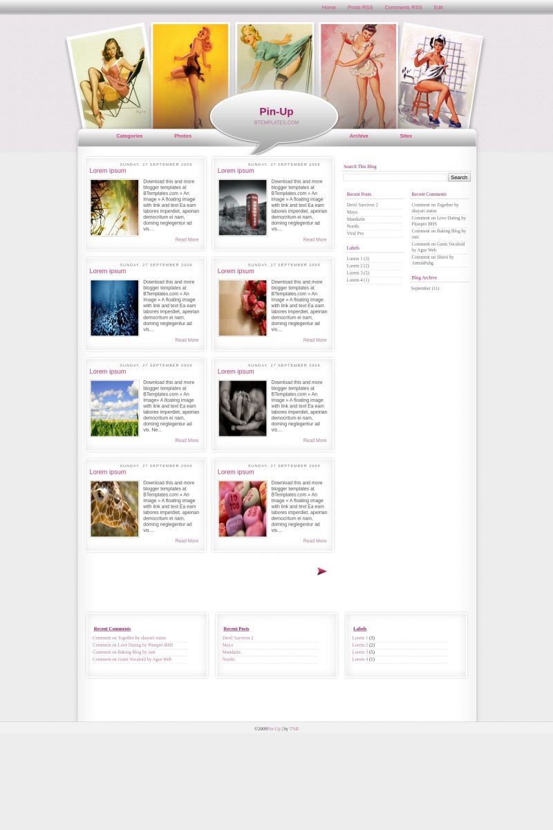
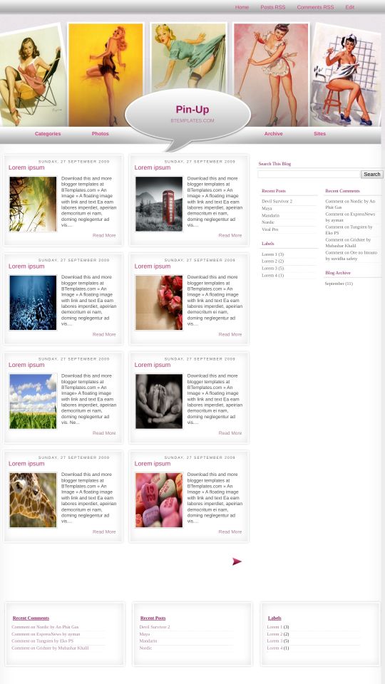
Introducing Pin Up, a free Blogger template featuring 4 columns, right sidebar, post thumbnails, feminine aesthetic and vintage aesthetic
Perfect for blogs covering art, personal journals or people.
More Art Blogger templates:
Credits
Author: Templates Novo Blogger.

mya 22 March 2010 at 11:27
since this was so helpful before, i thought i would ask another question: when created new pages for the header links in blogger, it only allows me to have one post (you can see if you click on my name) and it wont expand the about us section to a “read more” mode. is there anyway to fix this? either to have it take it to the read more style full page, or expand the box to accomodate more text? thx in advance!
Toria 25 March 2010 at 12:33
I’ve just uploaded this template (love it!!) but the links just below the pics that are supposed to go in the gray bar are too high, is there a way I can adjust them so they’re in the right place please? In dummy talk if you wouldn’t mind, I’m not too good with code.
Thanks,
Toria
Toria 25 March 2010 at 12:48
Never mind! I just needed to add a blog description and now they’re all lined up! D’oh!
Thanks,
Toria
Toria 26 March 2010 at 4:26
Sorry, another question. My recent post widget that came with the template doesn’t seem to be working and when I try to edit the widget itself via the page elements section it opens a small window that’s blank. Can anyone help please? I don’t want to use the one I can get through blogger because the style doesn’t match.
Many thanks,
Toria
Claudia 26 March 2010 at 20:52
Toria:
If the recent posts widgets does not work, add a new Feed widget as it is explained in the FAQ and forget the older ;)
Toria 28 March 2010 at 7:35
Thank you, all sorted! :)
crystal 6 April 2010 at 13:18
Hi, I changed my layout template but can’t seem to find the login, dashboard, customize and new post links.. Now im stuck cuz I can’t login. Can you please tell me how to fix this?
Thanks!!
Claudia 8 April 2010 at 21:40
Crystal:
We always remove the Blogger navbar. If you want to get it back, please follow one simple step that is explained in our FAQ.
lu 15 April 2010 at 21:30
Já criei um link para video e outro para foto, mas quero colocar uma para contato, como faço para colocar?
Alessandra Lameira Lima e Silva 19 April 2010 at 19:31
:P
La Alex 2 May 2010 at 5:45
@Claudia: Great Work! Thank you!
hanamyori 2 May 2010 at 18:31
i can’t use this template .. hepl me ! :'(
Corinda 14 May 2010 at 21:48
Hi, I love your template ! Although for some reason it doesn’t look right. The speech bubble on the front page is half blocked by the posts. As well as the buttons at the top, “categories”, “photos” etc are a little higher than in yours. Can you figure this one out for me?
-Corinda
Jason 17 May 2010 at 11:58
Hey guys i need some help. I just changed the outer wrapper width from 100 to 57%. I did this to crop out the outer white walls from the frame and it looks good on a desktop but on a laptop half of the page is missing. Is there any way to fix this. It happens on both Firefox and Safari. Please look at it on a desktop and laptop so you will know what i mean. Thax again for any help.
Jason 20 May 2010 at 8:48
Hey guys the code for the post shown is not working properly. Please fix them as soon as you can. Thank You.
Cassandra 31 May 2010 at 1:11
Hello, this template is very beautiful and I’m using in my blog, you can see in cassandraencrenca.blogspot.com
But I have a question:
How can I use that menu above with the categories, photos, archive and site?
In my page it doesen`t work.
julio 2 June 2010 at 13:31
como puedo cambiarle el color al fondo..?? en lugar de blanco que sea de otro color..
Jason 5 June 2010 at 4:42
Julio quieres cambiar el color detras de los post o el color the afuera?? Porque es el mismo color pero separados.
Jason 5 June 2010 at 4:50
Cassandra just look for those words in the html it is under menu 1. Menu 2 is the bottom ones. There you can change them. press command plus f to bring up a finder. Type the words in there and it will find them for you.
Jason 5 June 2010 at 5:09
Does anyone know how to change the menu color?? You know the part where people press to go to different areas of your blog.
julio 5 June 2010 at 14:27
@Jason:
si quiero cambiarle el color a lo de adentro.. al espacio en blanco donde se muestran los post..
Jason 5 June 2010 at 17:31
@julio: Buscala donde dice #outer-wrapper y ayi esta. La dimension minima es 1023×750 la puedes hacer mas larga or mas corta. Si la haces mas corta se mira mal. Si tienes mas preguntas ve a mi pagina y me mandas un email.
yaquigirl 6 June 2010 at 20:48
Hi guys. I have been reading all your post and I finally figure out how to put my own pictures on the header…. and it looks great!!!!
Now my issue is that when I replaced the link and I preview it, it will not show the header..
Can anyone help me out please?
Jason 7 June 2010 at 0:22
@yaquigirl: What’s the address of your site so we can see what you mean?
YaquiGirl 7 June 2010 at 9:55
Thanks Jason but everything is fine now.
When I was doing it yesterday the headers would disappear and when i left it like that… So today I log in and is there so IDK what happened.
This is my like any way.
I love this template and thank you so much to the designer.
Jason 8 July 2010 at 1:12
Can someone please tell me if i can add an image to my Home link the one between the 2 arrows for going to the next page. I changed the arrows and added different images and would like to do the same to the home in the middle. Thax for any help.
Jason 8 July 2010 at 15:31
Hey guys only 2 of my post are showing up on my homepage. Please let me know how i can fix this issue. Thax for any help.
Claudia 9 July 2010 at 15:44
@Jason: I see that your blog doesn’t load fast. When you add too much videos, heavy pictures, ads and javascript elements, Blogger paginates your blog automatically. It means that Blogger may display 2 posts in your homepage to make your blog loads faster.
Katie 15 July 2010 at 12:38
I’m having trouble customizing the top header. I downloaded the link provided and then customized it in photobucket and when I went to edit the HTML I searched for the same link and then erased that and put in the HTML code from photobucket, but the image isn’t showing up on the page. I’m not sure what I’m doing wrong.
Claudia 15 July 2010 at 19:01
@Katie: You don’t need to put any photobucket code. Just replace the old image url by your new header url. Make sure that the direct url to your new header is right, or use a different photo hosting.
Kinaski 18 July 2010 at 17:19
Hi, it’s a great template but I’m having troubles with the pages – they show as previews even when you click on “read more” link. Is there any way in coding that I can go around it so that the page would open up fully just like posts do? Thanks in advance.
Claudia 19 July 2010 at 18:23
@Kinaski: Go to Design/Edit HTML, click on “Expand widget templates” and replace this code:
by:
Save your template. Does it work?
Kinaski 20 July 2010 at 13:57
@Claudia: No, it just kinda screwed it up more so that the text from the box went beyond margins of that little preview box, but still wouldn’t open the full page or the full text either. Nvm, pages might not be (that) necessary, as long as we have posts :)
Tere 11 September 2010 at 5:57
@Tina:
You cannot change the header, but you can cover it with your own picture.
Go to design, edit header and upload a picture. Be sure that it will be in front of the Title and the Description.
xoxo
Tere 13 September 2010 at 1:41
I love this template and have seen how to change the header image.
— o —
I am writing because have another kind of problem.
Please, somebody and Claudia, help me with this:
When I am on MySpace and copy a link from my blogger, everything is alright. The picture is clear and the description is fine.
However, when I add a link on Facebook from my blogger, the description is in html.
What´s wrong? Please help me because it looks horrible.
Thanks!
Ashley 19 September 2010 at 15:48
I’ve changed the links at the top of the page in the bar. But the first link does not work. The other three work but I don’t understand why the first one doesn’t work.
About Us
Also on the page I’m trying to link it won’t expand to show the entry any ideas?
Ashley 19 September 2010 at 15:50
Trying to post the code it didn’t work.
[code]
About Us
[/code]
Ashley 19 September 2010 at 15:53
pardon my lack ofknowledge in the coding process jeez had no clue this would be so flippin difficult.
‘http://themagnificentlucas.blogspot.com/p/about-us.html’
there is the site I was talking about thatwon’t expand.
creativechick 6 October 2010 at 2:23
First, thank you Claudia for the nice template. I have been customizing my blog and want to know if there’s a way to add gadgets/widgets to the area underneath the posts. I have a lot of links in my blogroll/sidebar stuff and there is a lot of extra space underneath where the post boxes are. I’d like to fill it with a gadget/widget section so I can add whatever to that area.
Ashish Sawant 10 October 2010 at 10:18
Thanx Rai, Jason, Claudia.
Finally i got nice templeate, i was looking for a template which should be able to show all my post in one page with ” Read more ” tab and Finally i got it
Thanx for creating such a nice template..
Only thing i could not change RSS and Comment RSS tab. Actually i am not aware with what is RSS. i read all definations available on net but i could not understood the basic concept of RSS. i kept it like that only. if you guys can throw some light on it, it will be greatful.
thanx
Claudia 11 October 2010 at 15:31
@Ashish Sawant You can find the answer to your questions and more in our FAQ section.
RSS is for easy blog subscription ;)
Jason 12 October 2010 at 0:16
@Creativechick Could you please tell me how or where did you get the custom handwriting on your blog. Like Inspiration word. I like the writing. Thax
creativechick 13 October 2010 at 1:06
@Jason: The font is called Jackie Sue. You can find it at myfonts.com.
Jason 21 October 2010 at 16:01
@creativechick thax so much.
Dayane Jackson 2 November 2010 at 16:07
eu amei esse template ! Pin up são tão bonitas ! quero fazer um blog , espero começar a faze lo logo … estou anciosa . realmente muito bonito este template ! pin up , lindas , lindas … ♥
Jason 2 November 2010 at 19:12
Hi i wanted to see if anyone knows how to lower the 2nd menu just a bit. I know how to lower the first menu (the very top one) and the side bar and post page but not the navigation menu. I just want to lower it about 2 points. Any help would be great thax.
Jason 14 November 2010 at 9:35
Hey guys i notice that on the post headlines when you hover over them the color changes from pink to black or grey. I wanted to know where i can find the code to change the color. Thax for any help.
Claudia 16 November 2010 at 22:26
@Jason: Add this code in Design/Edit HTML, above
]]></b:skin>:The “FF0080” can be change by other hex color.
AshishSawant 21 November 2010 at 11:24
hi claudia,
need help on some issues. could u pls help out?
1. i need to create pages where i can post pages on different subject. is it possible?
2. Can i make Post border little darker on home page.
could u pls help? thanx in advance
Jason 22 November 2010 at 12:18
@ Claudia thax so much.
AshishSawant 9 December 2010 at 10:18
Hi caludia
if you could pls advice over my queries …
Jason 24 December 2010 at 6:31
Hey Claudia i was wondering if when you make a page on pages how can we get the readmore button to work. I made an about page and it goes to the page just fine but in order to see it all you need to press the read more tag which won’t work and won’t let you see the full page just whatever is in that little box. Thax for any help.
AshishSawant 24 December 2010 at 10:26
agree with Jason. i am facing the same problem. not able to open About me page
Krishanth 26 February 2011 at 13:58
hi
could you please tell me , how can i show the whole static page?
Thanks
AlliCe Antrax 28 March 2011 at 10:59
Hey ! Your template is pure genius , but I would like to make my own to fit my needs perfectly,but please,I really need help.I see that your posts are shown in thumbnails put side by side.How did you do that?I tried plenty of methods but they all look ugly and distorted.Please help.Thanks a lot and keep up the good work!
Jessica 11 May 2011 at 10:02
can someone please explain me how to apply this template? i already upload the file but it said they are unable to save the template. thanks!
Claudia 11 May 2011 at 23:11
@Jessica You can find the answer to your questions and more in our FAQ section.
Vik 29 May 2011 at 16:37
Can anyone post help with the ‘Read more’ problem with pages? When I add a page it will give a small summary with the ‘read more’ option, but it doesn’t open the full post. Any help would be appreciated.
Thanks.
Simone Smiles 8 July 2011 at 11:46
Hey, please somebody help, I’ve begun to use this template.. But, at home page my posts don’t seem regular. There are spaces between my posts… How can I solve this issue?
Simone Smiles 9 July 2011 at 12:12
I’ve managed my problem… On home page, display only 2, 4, 6, 8, 10 etc. posts…
But I have another question, on the pages we can’t expand the test! We only see a useless read more button! Is there any way to solve this problem? I’ve seen someone complaining about same situation but no solution!
Phillip 11 November 2011 at 16:40
Can you tell me how I can remove the title (in purple letters) from the banner? Thanks!
Yings 18 November 2011 at 5:59
my post titles are overlapping, i understand my post title may be a bit lengthy, but how do i solve it? i do not mind changing the font to smaller size but i cant seems to change it
how do i adjust the size of my posts? Can i just display post title and picture, while the write up be only display after they have clicked the picture on the post?
please assist soon
thanks