Evidens (White) Blogger Template
Instructions
About Evidens (White)
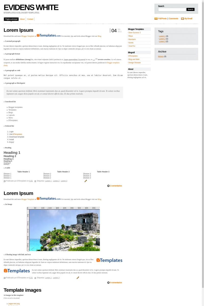
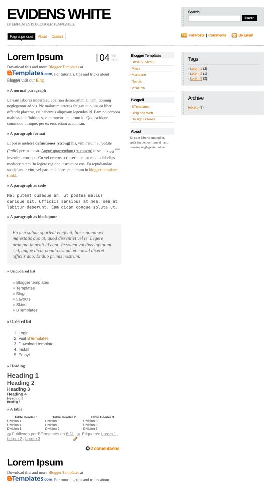
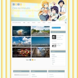
The Evidens (White) Blogger template is a sleek and versatile choice for various website needs. With its 3-column layout and right sidebar, it offers a clean and organized structure that enhances user experience. Adapted from WordPress, it combines functionality with elegance, making it suitable for business, internet, and neutral websites.
This premium template is fully responsive, ensuring your site looks great on all devices. Its modern Web 2.0 design elements, along with a range of color options including black, blue, gray, and yellow, allow for customization to match your brand's aesthetic. The template's neutral tone ensures it fits seamlessly into diverse industries.
Created by Blog and Web, Evidens (White) is designed with both style and practicality in mind. Its elegant design and user-friendly features make it an excellent choice for those seeking a professional and polished online presence. Whether you're running a business or a personal blog, this template provides the tools you need to succeed.
More Free Premium Blogger templates:
Credits
Author: Blog and Web.
Designer: Design Disease.




cho 1 August 2009 at 8:02
非常非常好看!
Floyd 1 August 2009 at 23:52
Great looking template, got it set up. These are some of my favorites and the fluid width looks good on my big screen.
sharaj 3 August 2009 at 1:16
looks good. I hope it’ll very useful for my blog. thanks
leprosys 5 August 2009 at 0:14
This is te best template. gracias xD
Esta es la mejor pnatilla. thanks x’D
Fahad Mohammed 5 August 2009 at 6:51
Hi. This template is awesome but I have one problem. The date stamp for me is displaying wrongly. Instead of 30(bold) jul 2009, its coming as Thursday (bold) 30 jul. How should I change that? Please help me. Thanks
B.P. Aryal 6 August 2009 at 21:06
It’s cool and great for my PC screen and web…It’s one of the best templates.
B.P. Aryal 6 August 2009 at 21:10
If something is changed in banner/blog title, it will be awesomely best.
Simon 13 August 2009 at 18:24
Very awesome template! I love the minimal and simplistic design. I’m currently using it now and it looks fantastic. I’ve changed the color scheme because orange, while I love the color, isn’t what I had in mind when it came to my blog.
Maxim 15 August 2009 at 15:47
Very nice templete
Dennison Uy 16 August 2009 at 10:10
I love this template. Design Disease templates are the best.
Esteban 17 September 2009 at 0:12
I found that Evidens template sends an error on Internet Explorer take a look at http://evidens-btemplates.blogspot.com
There is a javascript error on the right left status bar at Internet Explorer
Evidens is great !!!
boyz 7 October 2009 at 21:35
nice template..i love it
Memiliano 10 October 2009 at 15:40
Que buena plantilla!!!
aan 14 October 2009 at 18:35
Great template..
I use it for one of my blog. This template make my blog look elegant.
thanks
spiderpc 15 October 2009 at 23:37
How to fix the date? It’s wrong displayed. :(
Leonine Darkside 20 October 2009 at 1:49
At Fahad Mohammed > you need it to change… go to Page Elements and in there Blog posts there will be “edit”… choose that one and choose the date as like this > 19 October 2009. then save it and its done!! :D
Lindsay 3 November 2009 at 11:05
Does anybody have any idea how to cause the little tab to actually move and display for the current page rather than just for the homepage?
Thanks!
Gim 11 December 2009 at 17:41
I just downloaded this template, and I dont know how to edit it?
Can someone help me?
facemediagroup 16 December 2009 at 17:34
This template rocks…. been using it for a few months… clients love it.
KC 2 January 2010 at 0:00
The only problem that I have with this blog is that the dates keep showing up large and overlaying on the text of a post. Does anyone know how to change the size or fix this?
JENS 5 January 2010 at 2:29
I have the same problem like KC. The Date overlays the post-text.
How can this be changed? Thanxs…
Iglesias 7 January 2010 at 2:47
Ok, JENS, what you need to do here is the following, it seems KC did the same.
Go to Configuration, then click on format, and then change the way the date is displayed, and then pick the one that has the day with number, month and year, no day of the week displayed, this will short the amount of information you are showing on your date display,
I hope this helps
Iglesias 7 January 2010 at 14:10
The only problem i can see with this template is that there are links that cannot be modified with normal blogger editing tools, you have to do that with scripts, like for example, there’s a About me, contact, and twitter link and so far that cannot be modified easily with blogger…
Everything else, i think it is amazing, I am using it right now and I am gonna be checking other templates eventually!
unkonwn 10 January 2010 at 8:23
nice………….
Nixon's Ghost 23 February 2010 at 13:27
I love the look of this template, and almost believe it was designed especially for me.
The only gripe I have is with the location of the comment link for the posts. The very bottom-right corner of the post makes it seem too much like the comment is for the later post, rather than the current one. If there is a simple way for me to move this I would love to hear it. Otherwise, thanks for this!
Bruno 14 March 2010 at 22:39
hi everybody!! please, anybody knows how to disappear the search bar? it doesnt like me..
DNS 31 March 2010 at 12:32
Hi!
I love th template BUT Im trying to figure out how to delete/change the pre existing links (twitter, email me, etc…) can somebody help??
Claudia 31 March 2010 at 15:03
DNS:
Instructions are above (click on the “Template Settings” link). Maybe you should need to use Google Translate (translate.google.com) if you do not understand spanish.
Brina 18 May 2010 at 0:32
HI, I want to know how you can change the color Orange is not my favorite I wanted it in red Thanks Allot!!
Claudia 18 May 2010 at 16:39
Brina:
In Layout/Edit HTML, replace all #FF7E00 and #CC6600 (both orange links) and replace them by your desired hex colors (you may find a hex color generator if you search in Google).
eduardo césar 25 May 2010 at 17:00
Bonito template…
Só não consigo criar links para outras páginas :/
Será que eu tenho que criar ou editar a página HTML?
vedioclip 25 May 2010 at 18:21
cool design, thanx
Claudia 25 May 2010 at 23:06
@eduardo césar: Más arriba hay un enlace que dice “Template Settings” (destacado en amarillo) que te llevará a una página donde podrás ver instrucciones específicas para este template y para crear links a otras páginas.
Eduardo césar 27 May 2010 at 9:09
Claudia, muito obrigado pela sua ajuda, mas eu não falo espanhol, eu sou brasileiro e falo Português, mas de qualquer forma MUIto obrigado
Consegui fazer as páginas deste jeito que você me falou. muito obrigado, abraço!
ravi 15 August 2010 at 5:48
how can i add read more…. functinality in the posts as i dont like full posts
ravi 15 August 2010 at 6:49
how can i add read more functionality to this template, can you help, i dont like full posts on home page just a little synopsis is enough so want read more function in posts section
Claudia 16 August 2010 at 22:10
@ravi: Go to Settings/Basic/Select post editor -> Updated editor. Now, every time you want to use the “read more” feature you need to click on the “Insert jump beak” button in the Compose mode.
Pickelhering 28 September 2010 at 21:20
Hi!
I love this template. But does anybody know how to cause the menue-tab to display (and not only to hover) for the current menue-item rather than just for the homepage?
Thanks!
Yebsite 14 October 2010 at 13:14
hi.. how do i change the navigation? also you spelled twitter wrong… i need to change those links and i can’t seem to find it in the html..?
Dennis 20 October 2010 at 13:25
WHAT A GREAT GREAT GREAT TEMPLATE! Totally dig this one, but I have question.. How do I remove/edit About, Contact and Twitter at the top of the page?
Ana 1 January 2011 at 10:28
I downloaded the template but I can´t upload it. I keep getting this message saying that I need to make sure all xml elements are closed properly. What do I do?
Claudia 1 January 2011 at 18:43
@Ana You can find the answer to your questions and more in our FAQ section.
Joel 31 January 2011 at 5:00
THANKS! I love it! Check my Blog out, hehe!
Ryan 2 February 2011 at 20:15
absolutely love the design – however, one of my blog visitors said she couldn’t post a comment. when using either IE or Firefox she said when she clicks “Comment”, the comment form shows up but she can’t click on it. anyone have the same issue and/or know how to fix it? thank you!
syafwan 7 February 2011 at 17:09
hi, i love this template.. unfortunately i have a prob here, my comment form wont show up.. i tried what FAQ said but still wont fixed the prob. anyone know how to fix this? even if i use intensedebate it wont show
Claudia 7 February 2011 at 22:11
@syafwan: Go to Settings -> Comments -> Comment Form Placement -> Embedded below post.
Notice that “the embedded comment form can not be used if you have Post Pages disabled”.
CHsamples 28 February 2011 at 0:02
this template is great but i was wondering if the posts/body width can be made wider. I reduced the width of the sidebar but that still didnt make the body wider…any help/tip??
Kittu 29 March 2011 at 7:16
this template is really looking good..
will try once
Fayadh 2 April 2011 at 8:02
how to edit the menu bar?? please help me! cannot find it!
vee 16 July 2011 at 9:58
@CHsamples: the body is supposed to be fluid– meaning, it follows the width of your browser. As far as I know, the way the body is set up right now is perfect.
naomi 25 July 2011 at 12:00
hi there. one problem; the little share buttons underneath the posts keep on repating and have text behind them; what is this? and how do i fix it? cheers
berk 3 September 2012 at 21:47
i have the same problem with Naomi and i could not find how to fix it.
can you help me?
the share buttons of a post and the text of it are mixed..
Shubham 11 September 2012 at 15:00
I loved it too , its looking damn awesome and cool :D@Kittu:
atullaina 29 October 2012 at 2:08
very fast loading…