Gumball Special Blogger Template
Instructions
About Gumball Special
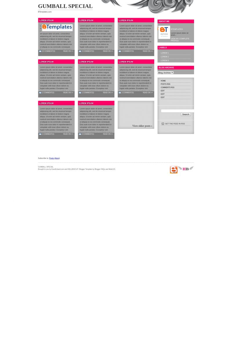
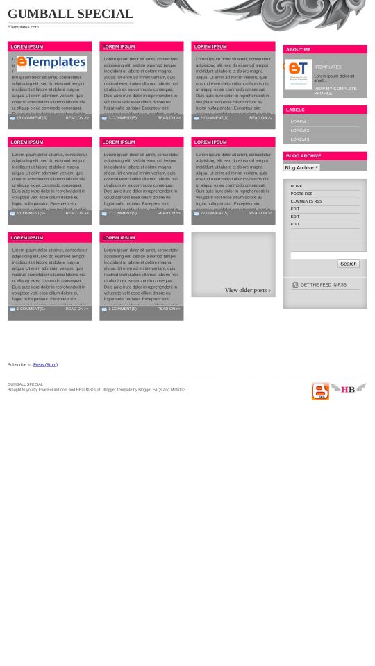
Introducing Gumball Special, a free Blogger template originally designed for WordPress featuring 4 columns, magazine-style layout, right sidebar, neutral palette and vector graphics
More Magazine Blogger templates:
Credits
Author: BloggerFAQs.
Designer: Hell Biscuit.


noname 20 February 2009 at 5:22
very good template.
one problem. I want to change the white background into grey but when I go to font and colors there is no option to change it. any ideas?
Thanks
blogspotter 21 February 2009 at 5:46
problems everywhere.
in layout it’s a whole pain to move up/down the gadgets.
it’s a real mess. I gave 1 star because I couldn’t give zero
zEEROCKz 21 February 2009 at 7:09
yeah you are right blogspoter….. I’ll look into that problem. I’ll be very thankful if you would mention other bugs in the template… thanks
zEEROCKz 21 February 2009 at 7:29
for noname:
to change the background color to grey. you have to follow following steps.
> goto Edit HTML section.
> scroll down the template till you find
body {
margin:0 10px;
font-family: Tahoma, Geneva, Arial, Helvetica, sans-serif;
font-size: 11px;
color: #333333;
}
> just add this line inside the {}
background-color:#A7A7A7;
> now it would look like this
body {
margin:0 10px;
font-family: Tahoma, Geneva, Arial, Helvetica, sans-serif;
font-size: 11px;
color: #333333;background-color:#A7A7A7;
}
blogspotter 21 February 2009 at 7:42
I did that yesterday.
Sorry, I didn’t wanted to be mean with you. I was just upset because it took me some time to put the gadgets and later I couldn’t arrange them. sorry
also, if it’s possible don’t use that white background. posts look like if they were thrown on a piece of paper and they look loose.
if it’s possible make the post areas recangular (same width but longer like banners) and not square
thanks
zEEROCKz 21 February 2009 at 10:59
hey blogspoter, you can still use the template but I’m not very experienced in playing with Blogger. To quickly rearrange your widgets, pick one and quickly throw it to the place you want, that works good.
I’ve already told you guys how to change the overall background color of the blog from white to grey.
but if you want to change the background color of posts (which is currently grey), you can do the following…
>> Search for this code in your template
#col01 .home-post .excerpt {color:#333333;
height:190px;
overflow:hidden;
padding:12px 12px 0;
font-size:11px;
line-height:16px;
background:#a7a7a7;
}
>> Change this value
background:#a7a7a7;
to this
background:#FFFFFF;
>> Now Posts background color will be White.
noname 21 February 2009 at 21:40
it’s similar to Cellar Heat ..similar to or too similar..
zEEROCKz 22 February 2009 at 1:40
yeah, Cellar Heat was also designed by Evan Eckard and this theme also belongs to him. The main difference is almost no ise of images due to which this one loads very fast. While cellar heat has around 500kb images in the background.
blogspotter 22 February 2009 at 4:58
I couldn’t even change the template to cellar heat. I was getting an error BX- – —
I usually get that error a lot of times.
I read a lot about bx errors but I can’t fix problems.
at first I load a very simple blogspot default template, then I delete all widgets etc and the problem persists.
only 5% of downloaded templates work for me :(
zEEROCKz 22 February 2009 at 8:40
hey blogspotter, that is a Blogger platform failure.. even I get that when I convert and test different templates. you know one of my sites (www.mobi123.me) doesn’t have comments system enabled. I’ve tried several templates but all in vain.
blogspotter 22 February 2009 at 10:30
I don’t understand the reason why some people load the templates without problems and other people can’t.
what helped me a little bit as i read somewhere is to use google chrome instead of other browsers. some templates loaded successfully with chrome.
zEEROCKz 22 February 2009 at 11:06
for blogger errors, you can always try one method, that is to remove your browser cookies and cache and then restart it. That works for me in Firefox.
Deluxe Templates 23 February 2009 at 17:00
for blogger error: bX-bliced, solution is here
loosma 24 February 2009 at 15:42
man this layout is incredibly difficult to work with :/ and it’s so glitchy and things are just kinda all over the place :( It’s so upsetting because it’s so similar to allkpop’s and I love theirs but man D:
I think this layout would function so much better in wordpress vs blogspot or it really needs fine tuning before going into blogspot. Such a shame, I love love love loveee the concept.
loosma 24 February 2009 at 15:44
and I saw the other versions, but since I really want a girly or minimalistic quality to it, I’m not gonna bother with CH’s verions
lismrog 28 February 2009 at 0:41
I love this template, and i was able to customize it to my needs for the most part, but i’m having a terrible time with the comment display. The image i.d.’s don’t show up, and more importantly, the comments aren’t lined up with the person who gave them. Really everything’s wrong with it. Help! Anyone. i really like this template, but i don’t know where to go from here.
zEEROCKz 28 February 2009 at 7:46
Hi to all users, yes this template have some problems regarding widgets placement and comments. I’ve started to work on an improved version, so please keep an eye on this page and on my homepage. You guys will soon see a stable version, thanks!
zEEROCKz 28 February 2009 at 8:53
Guys I’ve figured out both errors of Comments Display and Widgets Placement. Now you can download the full template from this direct link below.
http://53cqra.bay.livefilestore.com/y1pxVPuoDKtZIpK6p-kwmyUSvIgxs_YUbjoh8lsXOCWtrL4l0RtXjtgN1tA9FxsaTZ5WldD2mYI82Nzt3JqGR3K4Q/Gumball%20Special%20Fixed.rar
or you can visit my blog for more details or any help.
http://bloggerfaqs.blogspot.com/2009/02/gumball-special-blogger-template.html
Hey Btemplates Admin, please update the download link with new template. The old template is causing chaos among readers.
Vdesign 1 March 2009 at 13:09
Saludos…
La plantilla esta muy bien pero tengo un problema… he cambiado la imagen q tiene arriba por otra, pero nose como eliminar la cabecera, y en (diseño , elementos de la pagina) no me deja moverlo a la derecha…?? y queda asi http://vtshirt.blogspot.com/ si alguien sabe como solucionarlo…. estaria muy agradecida!!
gracias
Vikiworks Infinity Blogger Template 8 March 2009 at 17:37
Hey Guys, some of the readers told me that images are not centrally aligned when you are on the main page and full image is not displayed! To correct that, just find the following code in your “Edit HTML” tab.
#col01 .home-post .excerpt {color:#333333;
height:190px;
overflow:hidden;
padding:12px 12px 0;
font-size:11px;
line-height:16px;
background:#a7a7a7;
}
and replace the above code with following code.
#col01 .home-post .excerpt {color:#333333;
max-height:190px;max-width:220px;
overflow:hidden;
padding:0 12px 0;
font-size:11px;
line-height:16px;margin-top:1px;margin-bottom:1px;
background:#FFFFFF;margin-left:-12px;
}
#col01 .home-post .excerpt img {
max-height:190px;max-width:221px;
}
felipoween 15 March 2009 at 11:34
Hey I know how you can add more entries. they are more entries on the homepage, there are 15 then put 30. thanks!
Mayur Bhatt 26 March 2009 at 0:52
Wonderfull Web Tamplate
Hi Tech Web Solution
Mucize iksirler 21 April 2009 at 18:25
very good templates. thank for share
MMHighlights 22 April 2009 at 15:05
Hey! This is a great layout!
I saw tips on how to change the overall background, and the post background. What about the post header – how can the pink be changed?
Thanks!
sevan 22 May 2009 at 6:39
i love this one
İbrahim Saraçoğlu 9 June 2009 at 7:10
good templates 4 column
Ahmet Maranki 9 June 2009 at 7:15
it’s similar to Cellar Heat ..similar to or too similar.
An71qu3 15 June 2009 at 12:46
Omg i love this template .. but check out now the best advices about how to lose weight here
Jee 19 July 2009 at 10:31
Matthew 22 July 2009 at 11:59
Amazing template. Is it possible to display pictures in the column cells as well? If so, how do we select which portion of the image to display?
Claudia 31 August 2009 at 5:33
Alberto:
I can’t understand the relation between this template and your problem. Can you explain a little more, please?
Cody 7 September 2009 at 0:15
I’m having the same problem as Alberto. Any idea how to keep the flash videos and apps from popping out???
I really need help with this!
Thanks!
Cody 8 September 2009 at 0:35
To follow up with this…
It appears that it is only happening in Firefox and not IE. Any ideas why the youtube/ other flash players are coming out?
Thanks!
kitty99 29 March 2010 at 23:53
Love this template,but i do not know how to use it!!!
alvarito 10 August 2010 at 19:34
esta plantilla me daba errores. por eso la adapte a otra plantilla y quedo asi topmusicales.blogspot.com/
Amanda 18 August 2010 at 14:51
I have a question. I know the layout has experts (summaries of each post). I love that on my main page. How do I remove these from my other stand along pages such as contact page, etc. You can visit the pages of my blog to see what I mean. I gives a summary and the page cannot be seen.
alvarito 25 August 2010 at 14:29
add a gadget, list of links and places the address of the post contact me, Disclaimer, My Swap List, etc
michelle 24 September 2010 at 18:03
Hey, I’m wondering what is causing that weird border on the image (using the image instead of header text option) as shown on my (testing, dummy) site: onerat.blogspot.com
I’ve combed through the style sheet and code and cant find anything that would cause that dark purple border, couldnt even find that color. Help!
michelle 24 September 2010 at 18:08
Also, this only occurs in Firefox (mac). In Chrome and Safari it looks fine.
sabrina 24 November 2010 at 12:18
hello.. i have a question on this template.. when i try to post flash video/movie embed its over flowing in my home page even if i put an image to to link to my video…it automatically loading in home page… pls help what should i do.. i want to load image thumbnail only not inside my post.. it too slow when i open my blog.. i need ur advice thanks!
Laura 22 December 2010 at 15:52
I have a problem with this template. It doesn’t show the images on the frontpage, although I followed the instructions and placed them in the right folfer (post-images).
Anyone knows the problem?
abcnewsexpress 16 June 2011 at 11:19
I like this template most.