Magazeen Blogger Template
Instructions
About Magazeen
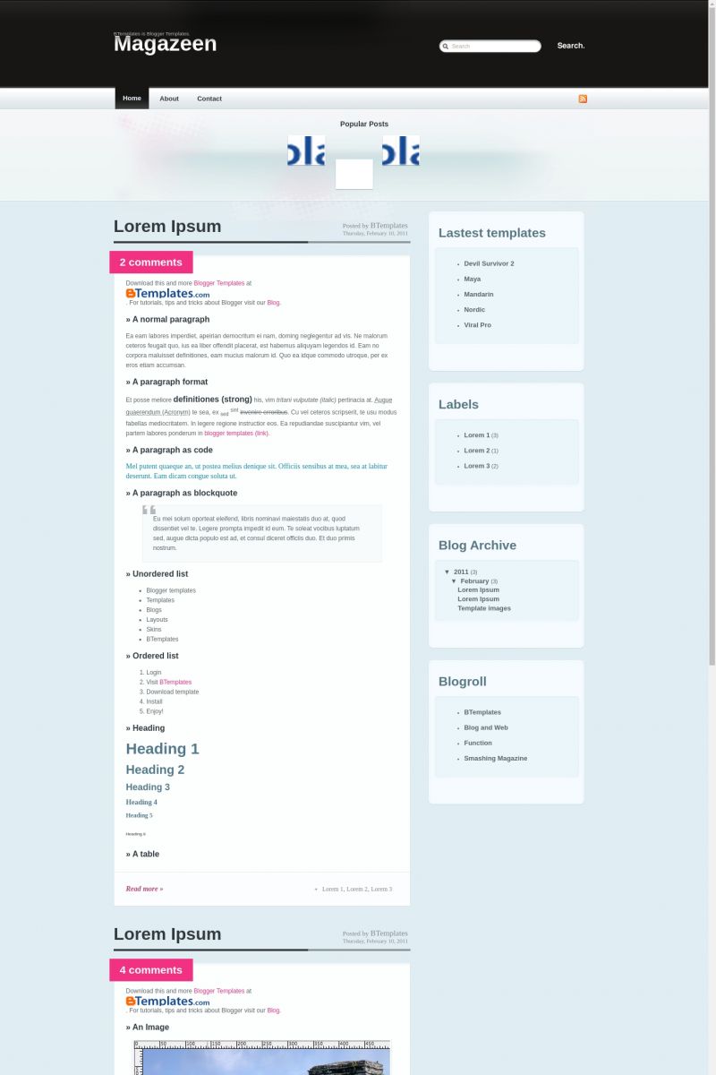
The Magazeen Blogger template is a sleek and modern design, perfect for entertainment and fashion websites. With its two-column layout and fixed width, it offers a clean and organized look that enhances readability. The template features a right sidebar, rounded corners, and a fresh color scheme of black, blue, and white, making it both elegant and visually appealing.
Adapted from WordPress, Magazeen combines the best of both platforms, offering a premium feel with user-friendly customization options. Its magazine-style layout is ideal for showcasing content in a structured yet dynamic manner, ensuring your website stands out in the crowded online space.
Designed by Blog and Web, Magazeen is tailored for those who want a sophisticated and professional online presence. Whether you're running a fashion blog or an entertainment site, this template provides the perfect balance of style and functionality.
More Free Premium Blogger templates:
Credits
Author: Blog and Web.
Designer: WeFunction.



karahann 12 March 2009 at 9:03
thanks
UFO City 13 March 2009 at 0:58
Nice template.
Marcos 13 March 2009 at 11:05
thnx
very gooooood
david 14 March 2009 at 4:40
Cool. I will try it
aRdZ 15 March 2009 at 0:17
thank you….
i’ve been searching for a long time for this template
that is very coooooooooool
Hangga Nuarta 15 March 2009 at 0:34
Yeah! Thanks 4 share!!
Tiara 15 March 2009 at 21:30
Just downloaded this onto blogger.com. Onto my new blog. How can I change everything into English. All help is greatly appreciated.
English girl 17 March 2009 at 21:22
how do you change the continuar leyendo to english??? i cannot find the tag anywhere! any help is greatly appreciated!
Reinashi5.net 23 March 2009 at 12:54
Buena plantilla
Yesilcam Cafe 25 March 2009 at 6:50
Thanks. good theme
Tam Bir Blog 28 March 2009 at 6:08
it works…
lawrence77 29 March 2009 at 2:56
Wow! nice theme!
Amusing
pclion 30 March 2009 at 13:30
That theme is really awesome, thanks. I’m using it now on my blog…
badjingskie 3 April 2009 at 4:08
very nice template! thanks for sharing it.
i have uploaded it to a new blog i’m planning to set up.
i have tweaked some things like the “continuar leyendo” stuff and changed it to “Read Full Story…”
harbah 11 April 2009 at 10:15
nice template. thx.
Blogs Badajoz 3 May 2009 at 19:51
I´m using this template in my blog and it´s really nice, i´m very happy.
Greetings
yhvf 2 June 2009 at 2:30
gooooood
Gabriele Lopez 14 June 2009 at 13:17
thanks it rocks!!
nate 7 July 2009 at 15:37
thanks!
But — how do I change the font color of comments? It is the same color as the background – so you can’t read it?
please visit n8phillips.blogspot.com to see
thanks!
laura 1 August 2009 at 22:51
I don’t like the comments being at the top of the post is there anyway to delete this and use bloggers comments?
Thanks for the template
Faz 15 January 2010 at 22:21
why on earth didn’t you provide drop down menus? :( It’s such a bitch to create one.
awesome layout though, gonna have to find another that that has drop down menus.
Samuel 13 February 2010 at 21:42
Muchas Gracias, muy bueno
Burticus 15 February 2010 at 20:56
Nice template, I’m starting to use it. I wonder if there’s an easier way to manage the feature post dock. It seems that I have to crop my images, then re-code the template to fit the images and link each post. Is there a better way to work with this feature?
Serina 16 February 2010 at 10:53
@ Laura,
If you don’t want your comments count at the top,
i did this,
Go to lay out, edit HTMl
The Magazeen Html should be shown, there you have to find Comment-count. You can easy do this with CTRL + F and then search comment-count.
It should be the one on the very top of the HTML sheet.
If you found it, you’ll see comment-count; active
You have to change active to non-active
That way it doesn’t count your comments any more. BUT there still a pink thingy where the counting used to be.
Im not there yet to delete it.
Sorry is my english isnt that good here and there.
Hope i helped.
Serina 16 February 2010 at 11:14
@ Damian
How to edit the Magazeen header;
Go to lay out, edit HTMl
The Magazeen Html should be shown,
there you have to search to Magazeen
The code would look like this ;
Amarás esta plantilla. ¡Te lo prometo!
Change the word Magazeen into everything you want, and the url if you would like that.
Sorry is my english isnt that good here and there.
Hope i helped.
Mónica 14 March 2010 at 14:40
No sé cómo usar la barra de fotos de arriba..cómo haré para cambiar esas fotos y establecer un link con mi blog? Muchas gracias por la ayuda amigos, esta plantilla es de gran creatividad y belleza. Gracias Claudia
Mónica 14 March 2010 at 14:45
He estudiado bastantes cambios y la verdad está quedando bien mi blog sólo no puedo cambiar las fotos de la tira inicial. Alguién me puede ayudar?
I need help for cahnge de images the bar can you help me??
liberty 25 March 2010 at 16:21
@ Burticus
I need to know this, too! And I also can’t get the recent posts sidebar to work….
Urano 12 April 2010 at 10:03
Estoy utilizando esta plantilla para un vídeo blog pero cuando coloco loos vídeos de youtube, sólo me aparecen cuando despliego el post, y no en la home… antes sí funcionaba, pero ahora (desde hace un tiempo) ha dejado de hacerlo,.
A qué se puede deber
mil gracias
Claudia 14 April 2010 at 21:30
Urano:
Si estás usando un script para hacer miniaturas, debes considerar que éste no va a crear capturas automáticas de tus videos de youtube. Hay un script que sí lo hace por sí mismo, y que está incluido en la plantilla “Bloggertube” (está en este mismo sitio). Quizás podrías revisar esa plantilla (si tienes conocimientos avanzados de HTML, CSS y javascript), o de lo contrario, subir una captura antes de cada video para que ésta sea mostrada en la página principal, considerando que también se mostrará en cada entrada individual.
Edith 23 April 2010 at 13:34
Does anyone know how to fix the hover effect of the navigation buttons? The hover affect only apply to the “Home” no matter which page you are on. Tks.
Edith 23 April 2010 at 13:39
I found the following comment about the navigation. Is it the reason the hover effect has been disabled? Tks.
#navigation ul.pages li.current_page_item a:link, #navigation ul.pages li.current_page_item a:active, #navigation ul.pages li.current_page_item a:visited {
/* Crazy margins to pull up the hover image above the borders.*/
Claudia 23 April 2010 at 19:52
Edith:
What hover effect? I see the hover effect in the menu bar consists in an underline bold text, exactly as it is shown in the original WordPress theme you can check here.
Edith 24 April 2010 at 11:58
@Claudia:
Thanks for your reply. I got the rollover works already.
Thanks again,
Edith
The Style Raider 2 May 2010 at 12:20
Love this template – have figured out most thongs – but changing the background colours has got me scratching my head!
I want to change the light blue background shades – which bits of code do I need to change, please?
Thanks in advance for any help!
Norman 12 May 2010 at 20:45
Hello together,
great theme for my first blog experience…
I have two questeions about the “check out latest articles” bar.
Where i must edit the text to set my own one?
and
the thumbs are not in the same range in my tryouts. One is higher then the next one, what is my mistake?
Thanks in advance
Norman
Claudia 13 May 2010 at 21:08
@Norman: You need to find this code:
Your images must be 69×54 px.
THE UNHOLY 21 August 2010 at 9:01
I guess u pick and choose which question are important enough to answer…
anyways…
How does one edit the header to be able to replace it with my own header illustration?
The existing header is just a black abyss with type.
I would like it to be a little more personal.
Could u please help?
Thank you
nurman 28 January 2011 at 5:14
thanks, good theme
Francisco 10 February 2011 at 17:12
This template was uptated today! :)
Adeline 11 March 2011 at 9:07
Hi,
Could anyone help me with this template ?
How did you manage to change the menu on the top.
I know how to change the names but not how to make a link there.
(sorry for my very bad english)
And do you know how to make a link on the little images on the top ?
Thank you for your help
Claudia 13 March 2011 at 2:55
@Adeline: This template has been updated. So, the tabs will be displayed automatically when you create new pages (please, download and install it again).
Regarding those little images, please read my comment of May 13 2010. You need to replace every # by your URL with http://.
Lizbet 21 March 2011 at 9:54
How do I remove the search bar?
Claudia 21 March 2011 at 19:28
@Lizbet: Go to Design/Edit HTML, click on “Expand widget templates”, remove the following code and save changes:
Lizbet 22 March 2011 at 2:56
Thank you very much! :D
fehl 1 June 2011 at 23:20
The layout looks amazing! Thank you for creating this. :) Can I ask how to add a page element below the nav bar? I want to place ads at the center like a leaderboard below the nav bar but I cant put one without a page element. Thank you for your reply.
Claudia 3 June 2011 at 23:46
@fehl: Please, read this comment.
ANUPAM 9 October 2012 at 11:19
Great template but very difficult to customise
I wish I knew who designed the template so that i could give due credit to his work in my blog footer I have just included the template name.I wish i knew his name can some 1 please tell me his name so that due credit can be given to the one who designed it.