Green Leaves Blogger Template
Instructions
About Green Leaves
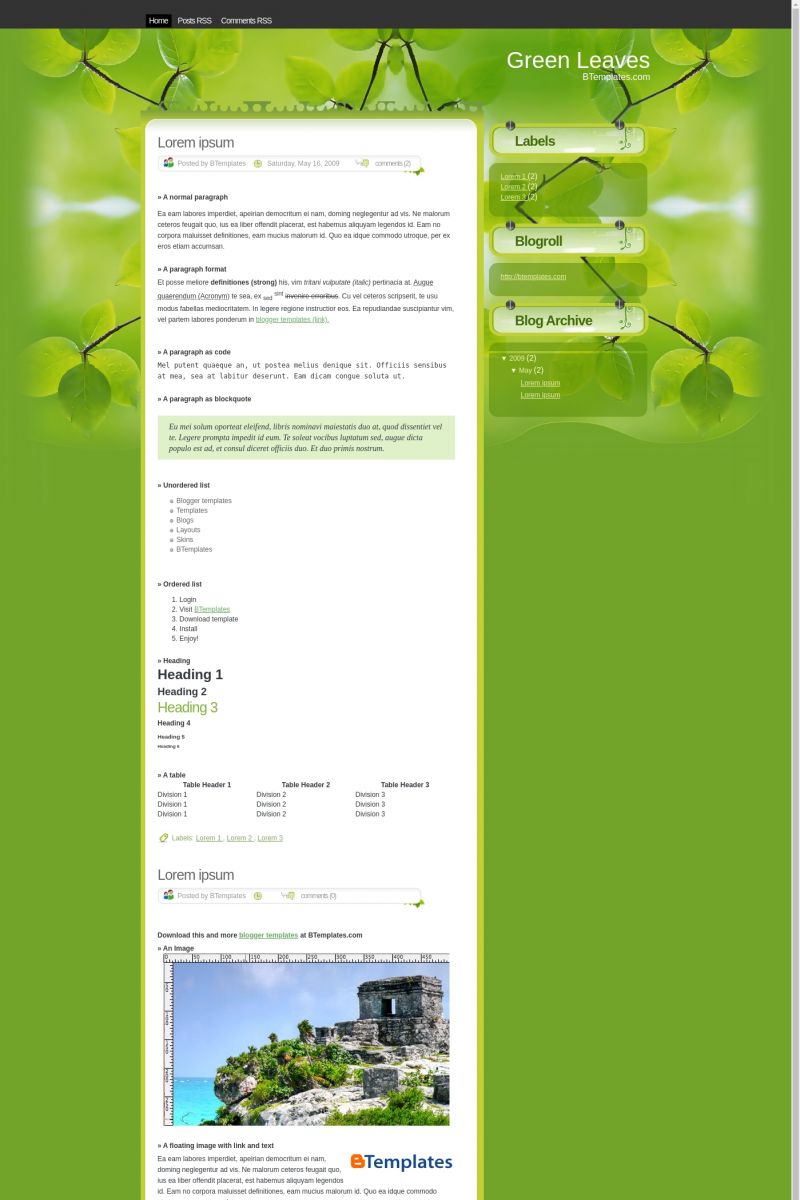
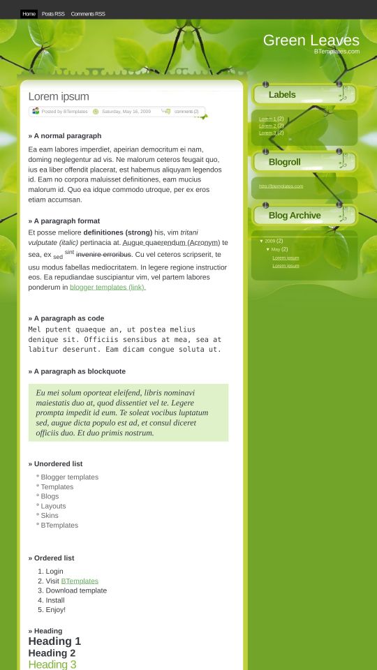
Introducing Green Leaves, a free Blogger template featuring 2 columns, right sidebar, clean, fresh appearance and rounded corners
Perfect for blogs covering personal journals or nature.
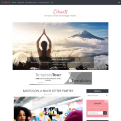
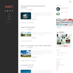
More Elegant Blogger templates:
Credits
Author: Ray Creations.



Blogger tricks 16 May 2009 at 12:53
Eco friendly….
Lock 17 May 2009 at 4:01
nice colour
AAA 27 May 2009 at 15:32
Would not work in Blogger
Haqque 29 May 2009 at 2:21
Good template!
August 5 June 2009 at 3:41
It’s awesome template.
I’ll use u it
HOan 6 June 2009 at 10:04
Por favor, publique o template Paradise Valley do site Ray Creations India.
kevinn 24 June 2009 at 1:16
its nature & its green for my new blog template
Mariflor 30 July 2009 at 13:57
No me sirve, osea cuando oprimo douwnload no me habre el codigo HTTP…
Chris 4 August 2009 at 7:28
I wish there were a 3-column layout for this template. I love this template.
Christina 7 August 2009 at 21:24
This template is nice if only you use its default settings. When I add some text or widgets to the sidebar, their content don’t have any background. It’s odd. Don’t want to use it any more.
pvvv ravi kumar 12 August 2009 at 5:25
haiiiiiiiiiiiiiiiiiiiii!
Rick 29 August 2010 at 15:02
This template doesn’t display photos correctly, either stretching all sizes out of shape or overlapping with the container box. Love the design but very complicated CSS and I wasn’t able to correct the template myself. The right box shows up at the bottom of the template instead. Pain in the ass.