Notebook Blogger Template
Instructions
About Notebook
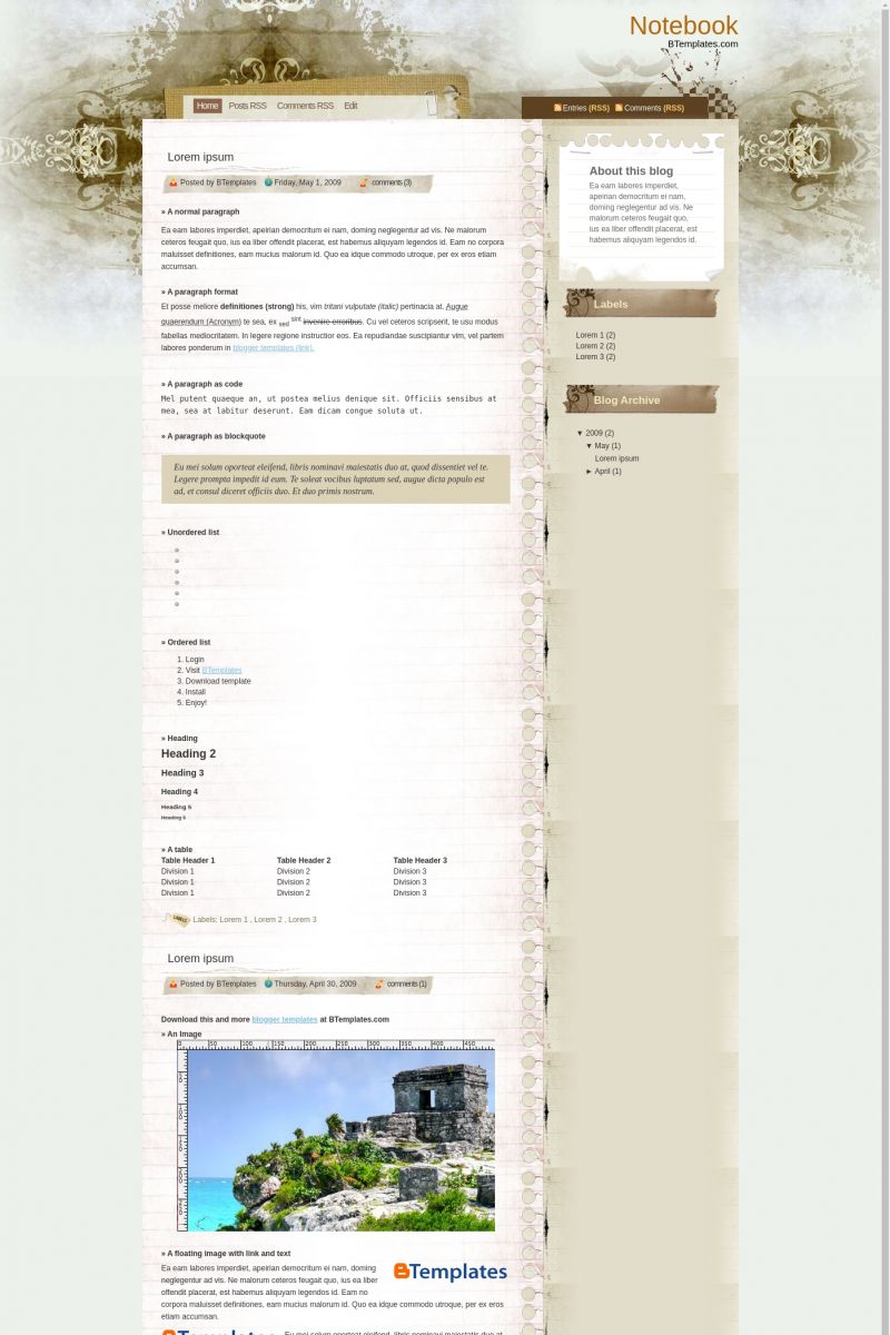
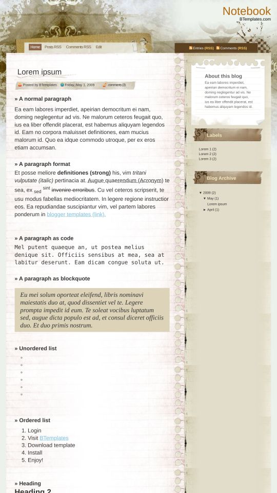
Introducing Notebook, a free Blogger template featuring 2 columns, right sidebar, grunge styling and vintage aesthetic
Perfect for blogs covering personal journals.
More Elegant Blogger templates:
Credits
Author: Ray Creations.




Jenn 1 May 2009 at 2:47
Oh I love this template! I’m gonna use this on my blog for sure.
sayrem 1 May 2009 at 8:00
used it. magically, it posed no probs.:D however it obviously won’t stay 4 long.
sayrem 1 May 2009 at 8:01
used it. wont stay 4 long tho :D
BLOGGERUSER 1 May 2009 at 10:25
One more Grunge style notebook blogger template. These notebook styles templates look great only because they have unique and attracting background images.
This template too maintains that quality.
Alvaris Falcon 1 May 2009 at 20:22
Grungy yet elegant look, thumbs up!
Mike 1 May 2009 at 21:36
Can I add linklist? :(
Vikram Singh 3 May 2009 at 5:31
Very nice template, can we expand the top horizontal menu bar a bit more..
Elisângela 5 May 2009 at 8:42
How Can I Expand the top horizontal menu bar a bit more? The looking in my blog is not good.
Thanks!
Vietmanga 5 May 2009 at 10:39
Like this template without too many images.
Edward 6 May 2009 at 11:18
the top of the design dosent show very well….actually the sheet covers it….help here plz…
Sil 8 May 2009 at 22:09
How do I apply this template? I’ve downloaded it, followed all the steps in Blogger, but once I upload it from my pc, the XML text appears like little squares and Blogger cannot read it.
Any tips?
Thanks!!
Quaggar 11 May 2009 at 9:26
I’m so loving this template. Classic, cool theme.
Installed with no hassles, thanks a lot!
sherlyn 13 May 2009 at 8:29
Love this template!
but i have the same problem as some of the people.
the top of the header with the ‘home’ etc tabs are not displaying well.
can someone help?
thks!
Sami 13 May 2009 at 11:59
Same here, Sil. I can’t get it to work for mine either. Please help us, someone!
Is 15 May 2009 at 21:18
Great job! It’s very classy, I love it!
Mike 21 May 2009 at 10:14
Positioning of the headers seems to work fine in Firefox but is broken in IE.
Rean 24 May 2009 at 8:27
hey, how do you apply a layout on a blog?
Marcus Aurelius 29 May 2009 at 7:47
Really really beautiful template ! The only problem is that header which stays hidden with Internet Explorer. It works with Firefox, Opera, Chrome… but not IE7 or 8 !
An71qu3 15 June 2009 at 13:07
Wow nice template and it s working so good … but i have some advices for you about how to lose weight and look as in your dreams .. to get abs and other nice stuff check out now here
Kathy 19 June 2009 at 17:26
I’m having the same problem as Sami and Sil. Can anyone help with this?
aşk şiirleri 22 June 2009 at 9:10
thanks theme
MRajput 26 June 2009 at 8:43
Having the same trouble with the header in Internet Explorer. Any tips yet?
aşk sözleri 16 July 2009 at 18:04
Really really beautiful template ! The only problem is that header which stays hidden with Internet Explorer. It works with Firefox, Opera, Chrome… but not IE7 or 8 !
izulka 22 July 2009 at 10:10
Thankx for this.
Valo 4 August 2009 at 16:26
por ahora adopté éste, pero tengo una pregunta, se puede elegir un formato y aplicarle un tapiz personal?? en cuyo caso me gustaría saber como se hace, gracias.
GZA 8 August 2009 at 21:03
You gotta change some value in the html code in order to change the way that top menu appears
try changing top height in this part bellow(just an example)
/************** CONTAINER *****************/
.container { padding: 0px; float: left; margin-left:0px; width: 522px;}
.contentTop { padding: 0px; margin-left:0px; width: 937px; height:20px;}
.menu { overflow: hidden; float: left; width:300px; padding:20px 0px 20px 80px;}
/**/ * html .menu { height: 1%;} /* */
jamespoetrodriguez 18 August 2009 at 15:31
Hello… this is a really beautiful template… but… i could not aply adsense and top banner on it… please someone tell me if i have to unblock or write or erase some part of the html code to get it…
Have a nice day.. ciao.
banana 13 September 2009 at 19:50
i installed the notebook xml template, adjusted the timestamp date. my only problem is that the date of the old posts disappear when i make a new post. this is really critical for me because this is a diary. i also want to know if time posted can be show instead of date only. any one got the same problem?
josue 19 September 2009 at 17:26
can i post link lists?
Josh 13 November 2009 at 23:56
I used the code above but I change the height in the contentTop part to 60 pixels and now it seems to look great.
xuenga 5 January 2010 at 6:22
côôL it works now ! Thx @Josh
xuenga 5 January 2010 at 6:24
50px looks better :p
.contentTop { padding: 0px; margin-left:0px; width: 937px; height:50px;}
helen 1 February 2010 at 16:45
hi I want to change the menu options above the posts as there are two sets of rss links how do I do this ?
Other wise its great thanks
exen 28 February 2010 at 15:09
es muy bueno
Susan E 29 March 2010 at 0:15
Thanks for the advise!
I experienced the same problem with the header being hidden in IE. It looked fine in Firefox, though. I changed the height of the top content area, as others here recommended. it worked like a charm. I increased the height to 60.
.contentTop { padding: 0px; margin-left:0px; width: 937px; height:60px;}
Gordon Wales 25 May 2010 at 18:32
Really like this template, but one BIG problem! The edit button does not work. Is it possible that there should be a small pencil after the blog? If so maybe it being missing is the problem. Otherwise I would appreciate learning how to rectify the edit not working. Thank you – Gordon
Claudia 25 May 2010 at 23:14
@Gordon Wales: Go to Layout/Edit HTML, and find this code:
You must paste this code above that line:
Gordon Wales 26 May 2010 at 14:52
@Claudia:
Claudia, thank you so much for your very quick response to my query. I could not trace the exact code you specified, the following one was all I could find.
There was no #3 (I scoured the coding), but there was another instance of the code you gave me to place above ‘post footer-line-3’>. I simply mention that, your knowledge of the template code being obvious.
Should I go ahead and post the code you gave? If so would I place it above the ? Or above the <DIV…..section.
Looking forward to your reply, with much appreciation of your patience. Gordon
Gordon Wales 26 May 2010 at 14:57
Claudia, I have no idea how a section of my letter disappeared, but the Post-footer-line3′ section was what I had typed before the question mark.
Claudia 28 May 2010 at 2:11
@Gordon Wales: If you didn’t find the ‘post-footer-line-3’ section, you should place the
<b:include data='post' name='postQuickEdit'/>under<DIV class='post-footer'>, too ;)Don’t forget to click on the “Expand Widget Templates” box.
Gordon Wales 30 May 2010 at 17:12
@Claudia:
Thank you again Claudia, you came to my rescue and the edit button now sits where it belongs! I’ve had some good feed back on the blogs appearance. Now everything is tip top except one small item, a strange one. When I receive a comment or place one myself the following symbols appear instead of where a bracket or an apostrophe should be:
for the missing brackets – "
for the missing apostrophe – |'
Can this be rectified? A follower emailed to say she’d stop using any symbols as she found it weird (her word) to see her comments looking so strange. I would appreciate it if there were something that could be done. Thanks again for your time given. It is great to have the creator of the template one’s using taking the time to help. Gordon
Gordon Wales 4 June 2010 at 19:04
@Gordon Wales:
I know you must be busier than the dickens Claudia, but I hope you can get around to giving me a suggestion on the HTML tag that comes up instead of an apostrophe in comments.
I must also tell you that Notebook is really great, and whatever happens about the glitch this is still the best template I’ve ever used. For that I thank you sincerely – Gordon
Claudia 4 June 2010 at 22:01
@Gordon Wales: Please, leave your blog URL when you comment. I need to check what is wrong.
Gordon Wales 5 June 2010 at 10:01
@Claudia:
Sorry Claudia, that really was remiss of me – Gordon
tara 15 July 2010 at 15:22
Can you explain how you changed the date stamp? My blog is now just reading undefined….thanks!
@banana:
Claudia 15 July 2010 at 18:52
@tara: Go to Settings/Formatting/Timestamp format -> Thursday, July 15, 2010.
Xavi 12 September 2010 at 5:35
I don’t know why, but I have tried to do your explanation to Gordon Wales… But it didn’t work.
On the other hand, someone knows how to eliminate the function of the right button of the mouse ¿? I don’t want that somebody can copy.
Xavi 12 September 2010 at 5:37
Please Claudia, another question… Can I change the size of the letters?
Many thanks!
Xavi 12 September 2010 at 5:39
and… as I can eliminate this: ” * Entries (RSS)
* Comments (RSS)”
For what serves this?
Xavi 12 September 2010 at 13:09
(ok, I eliminated the latest thing RSS, etc…). But, the firts questions… I dont know how do it.
cai 16 November 2012 at 23:47
The background is good but the “paper” is not so well.
sandra 17 July 2014 at 9:56
mil gracias